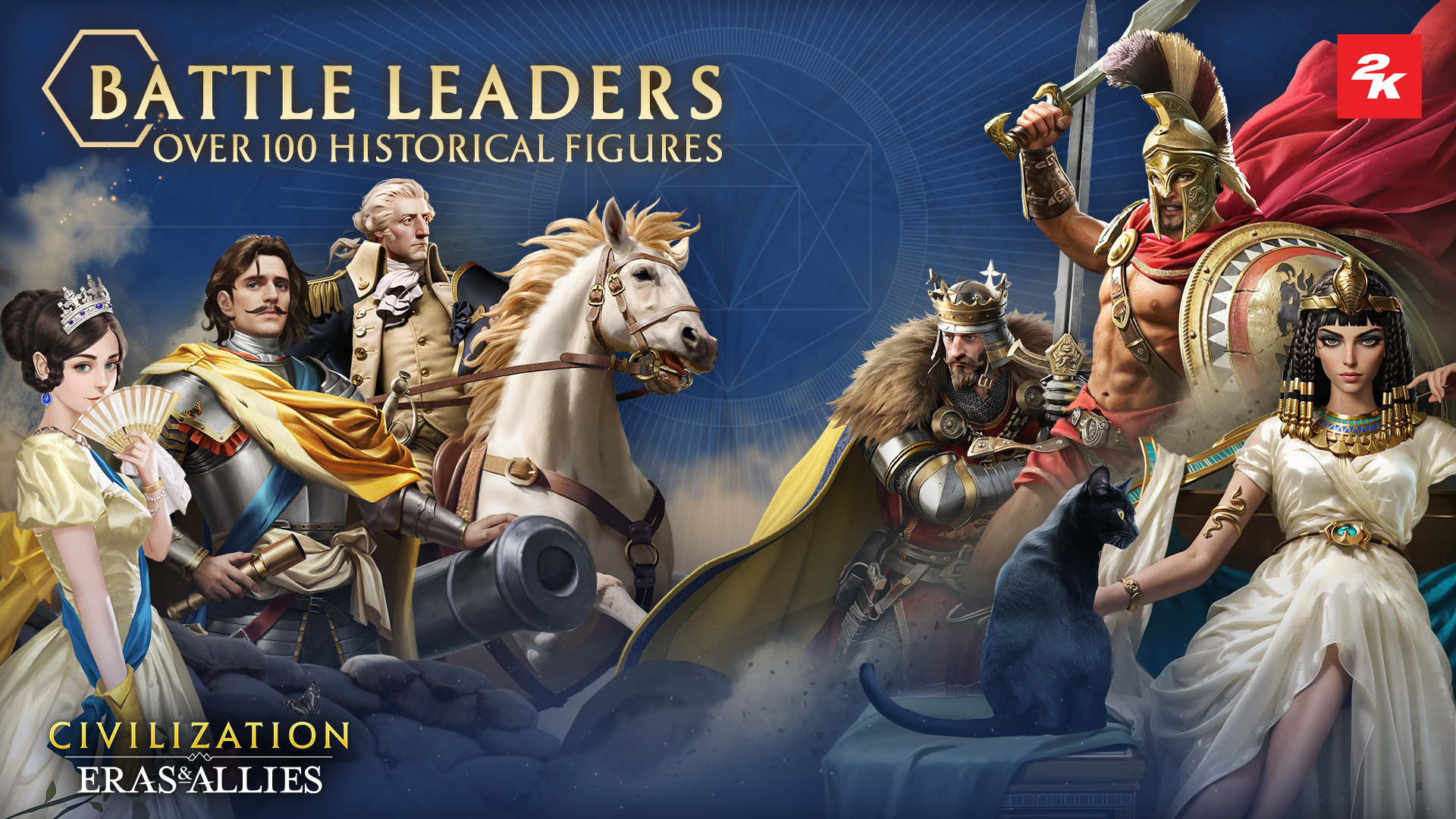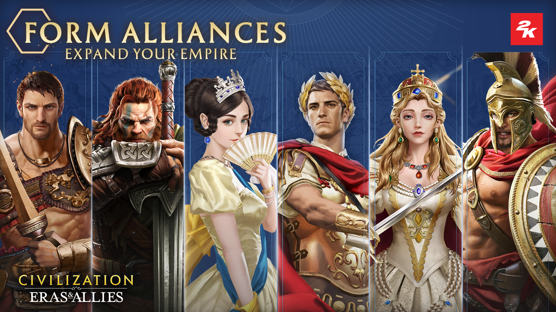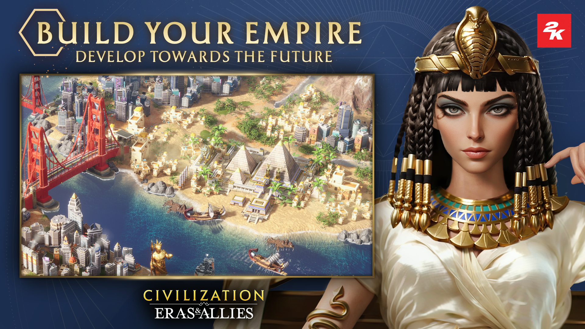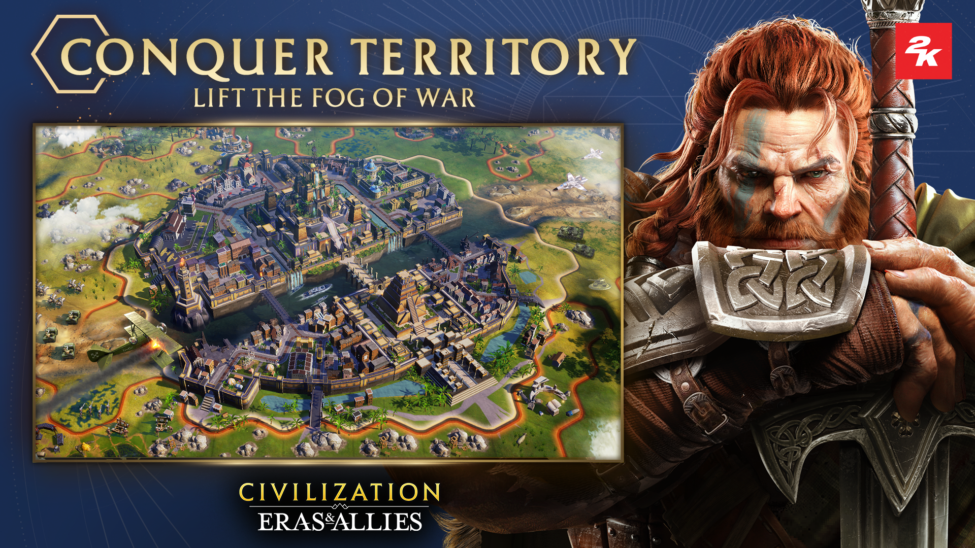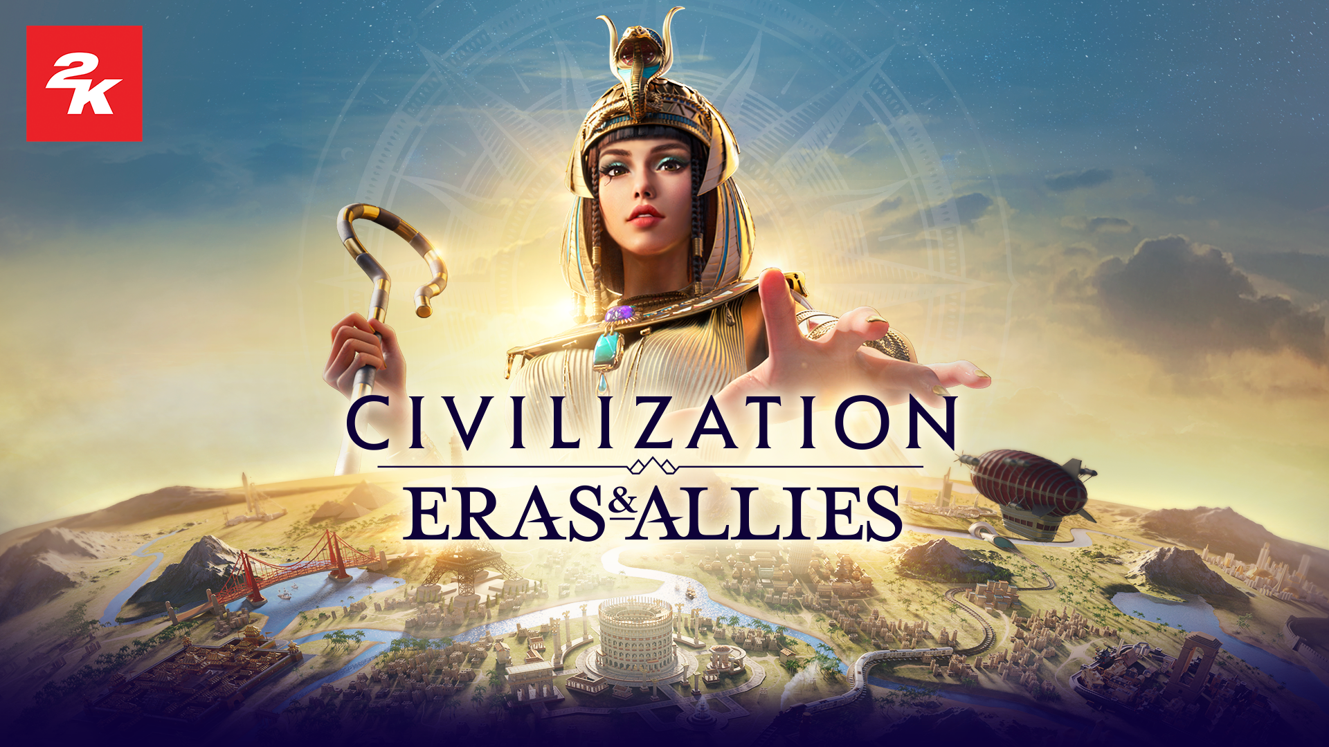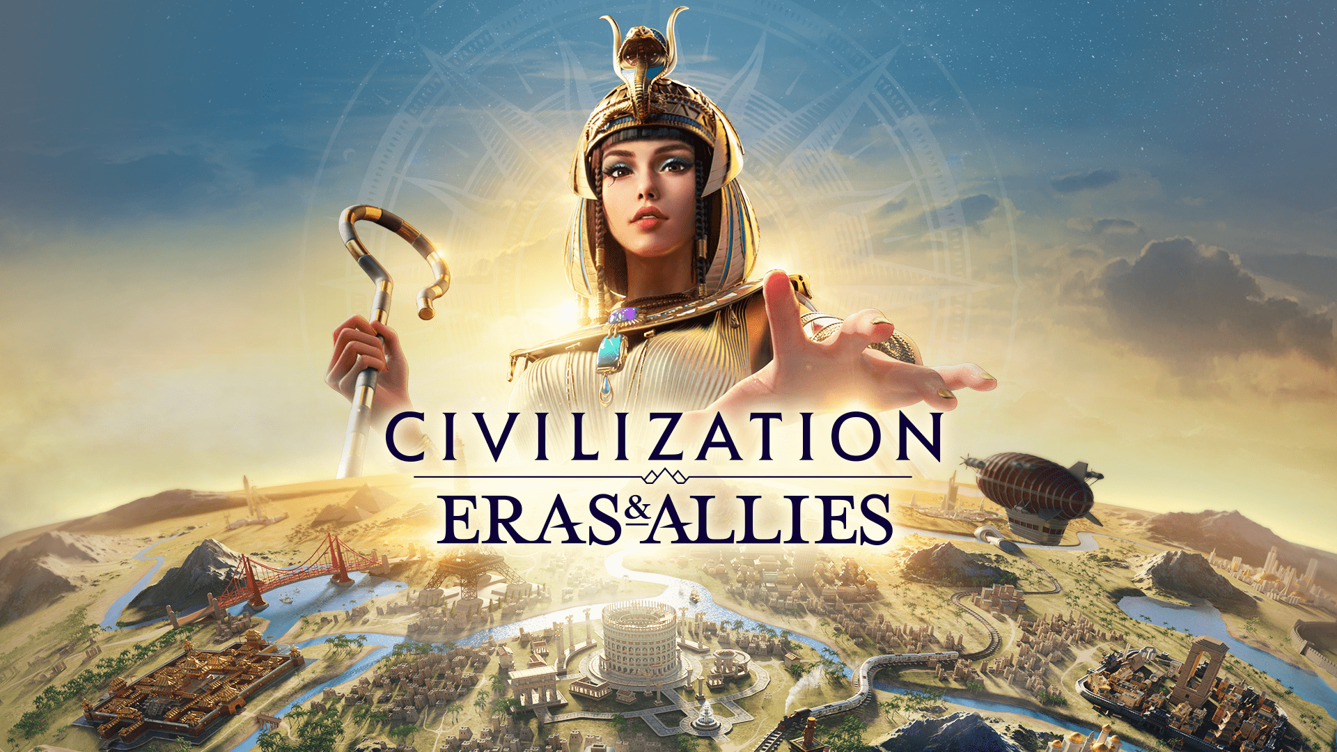
Civilization Eras & Allies
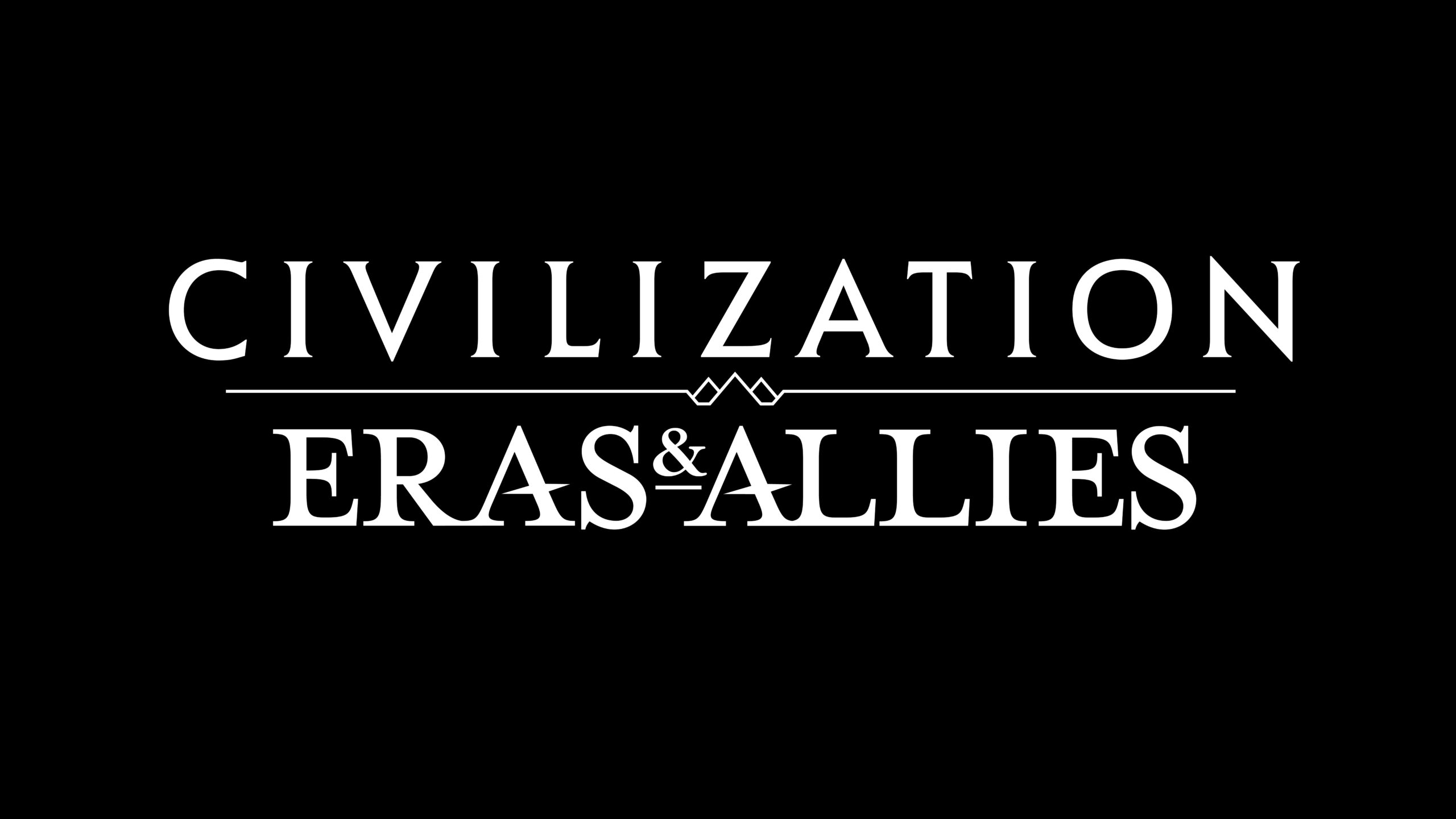
My role involved creating the logo design and various digital assets for platforms such as the App Store, YouTube, Twitch, and Facebook to ensure cohesive branding across all media.
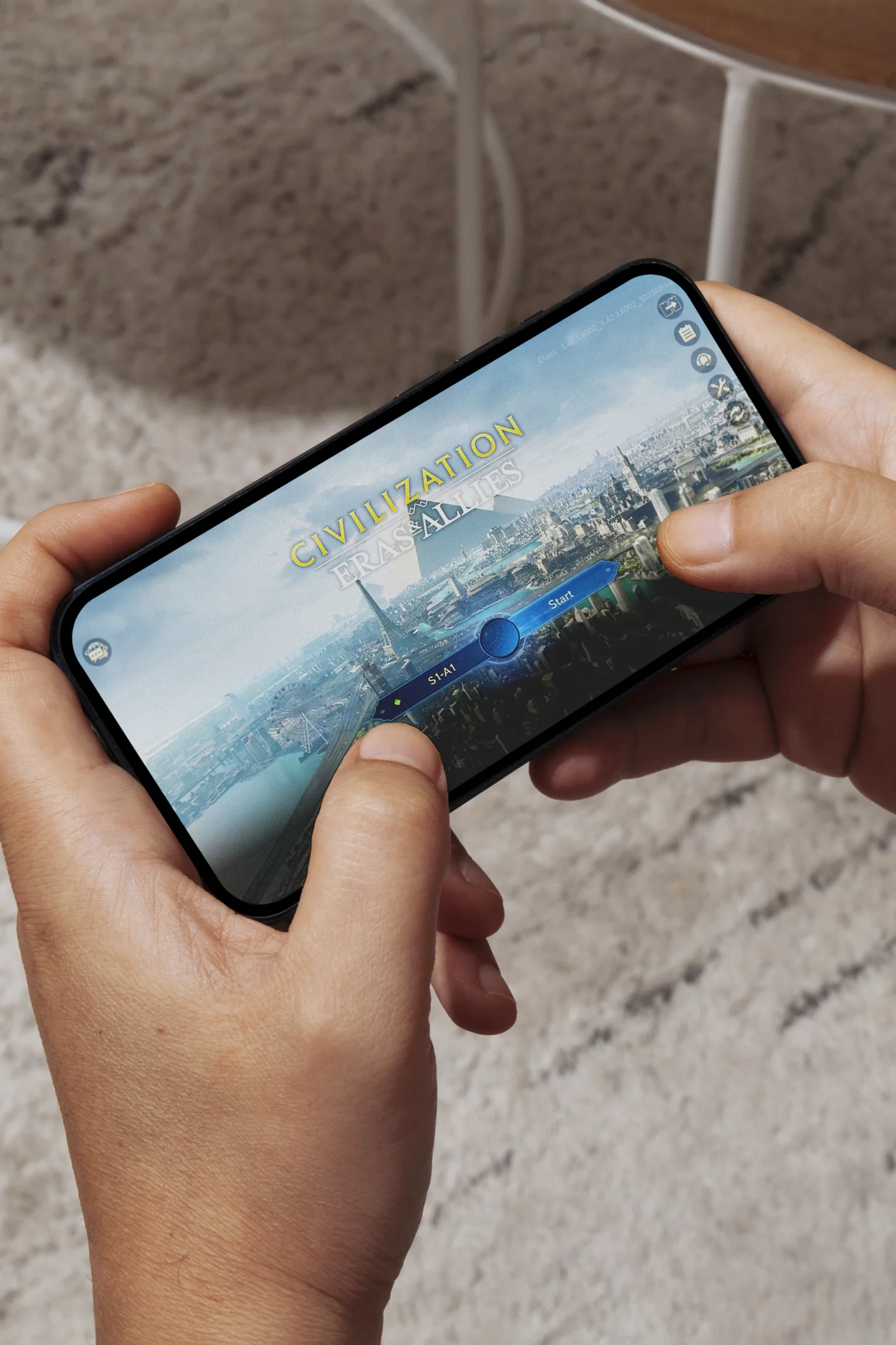
LOGO DESIGN
CHALLENGE
The primary challenge in designing the Civilization: Eras & Allies logo was to create a timeless and iconic identity that fits within the Civilization franchise, while being:
• Scalable and legible across mobile and digital platforms
• Visually distinct from the main titles on PC/console
• Cohesive with the established art style and brand pillars (prestige, political drama, history, exploration)
To meet this challenge, I analyzed the core brand values and studied successful game franchises. I then explored a wide range of typographic directions—balancing past, present, and future—while ensuring adaptability for UI and marketing.
INITIAL CONCEPTS
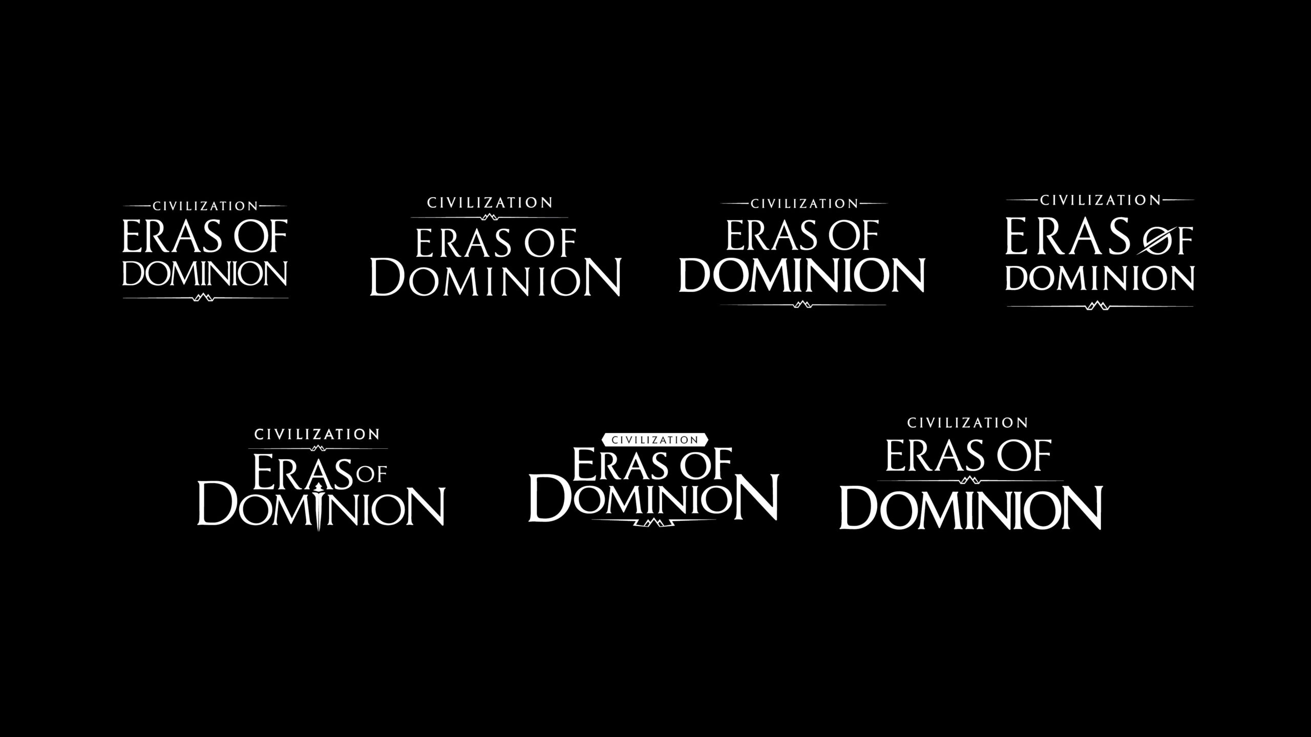
This project began under the working title Eras of Dominion. The early exploration focused on creating a logo that was stately, legible at small scales, and distinct from DLC branding.
From the first round, client feedback focused on issues such as:
•“Floaty” layouts and lack of weight distribution
•Overly similar font weights across multiple words
•Need for a balance between legacy (history) and ambition (progress/future)
I explored different typography styles to find a look that felt timeless, while still matching the Cyan font used in the Civilization brand. Many of the visual ideas from this early stage were refined and carried through into the final logo design.
“We need the logo to convey a sense of timelessness, capturing both the legacy and evolution of human history.”
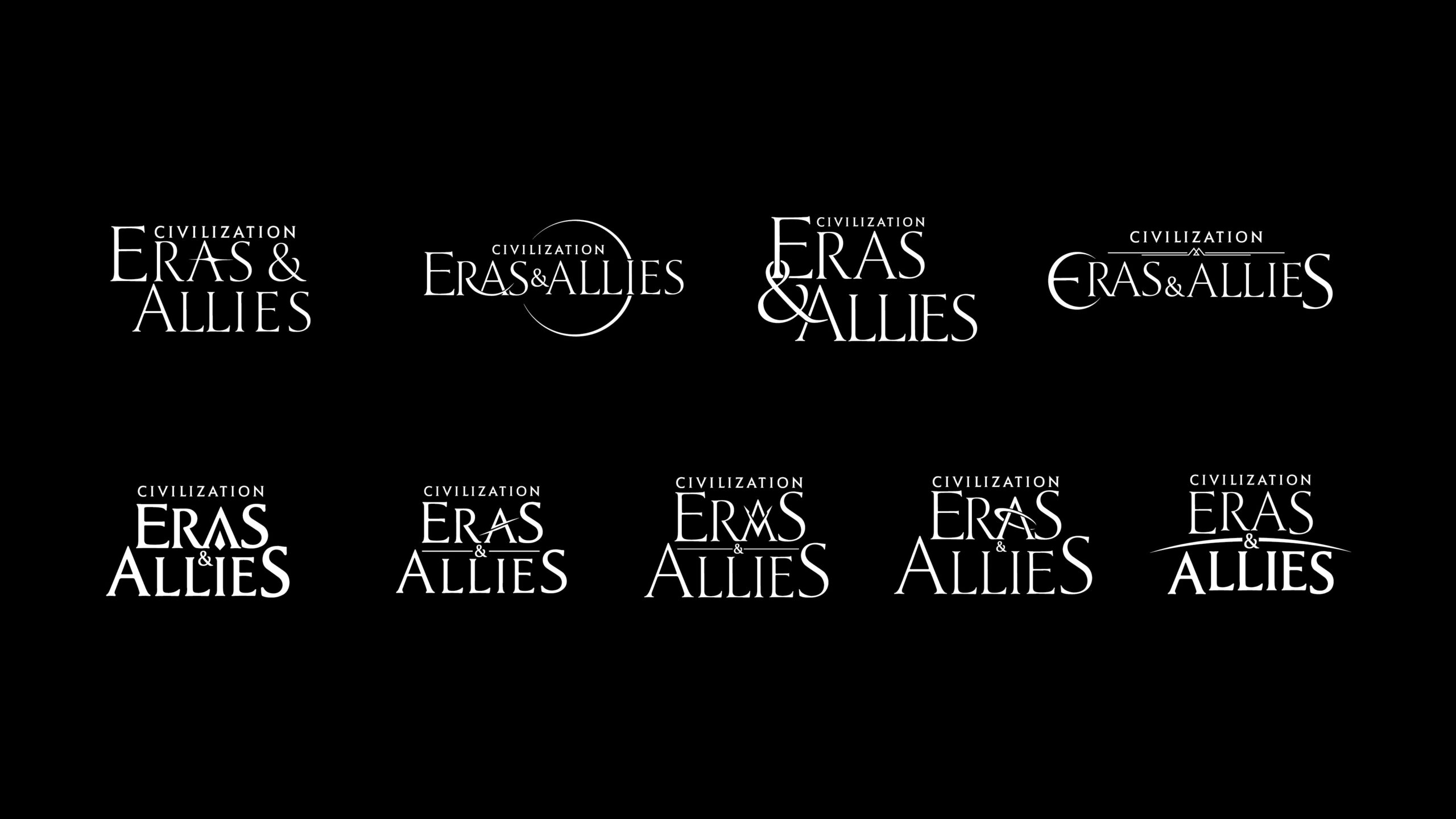
Then the title changed, and during that time, we explored a lot of options for the client. It felt like we were really refining the design direction, focusing more on capturing that timeless element.
To express “timelessness,” we explored metaphors from both natural phenomena and human heritage:
•Celestial patterns (moon phases, constellations)
•Historical markers (pyramids, monuments, terrain silhouettes)
•In-game references (torches, weapons)
Client feedback from Round 2 pointed to successful elements—such as the A-M-N triangle layout—and encouraged us to refine flourishes like pyramid dividers while minimizing medieval or overly aggressive icons.
“The easier it looks, the harder it actually is.”
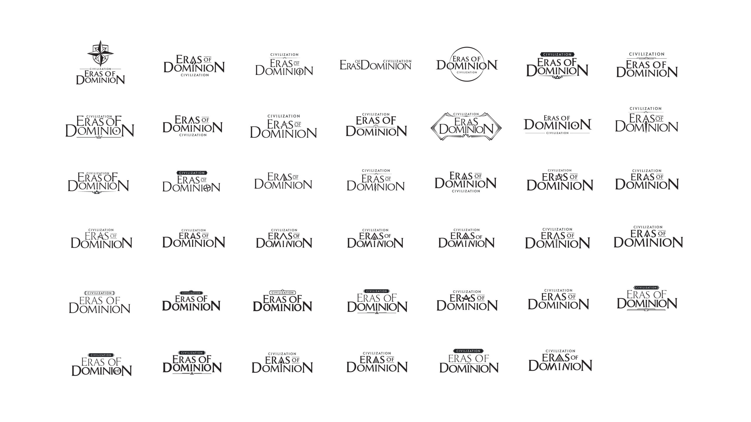
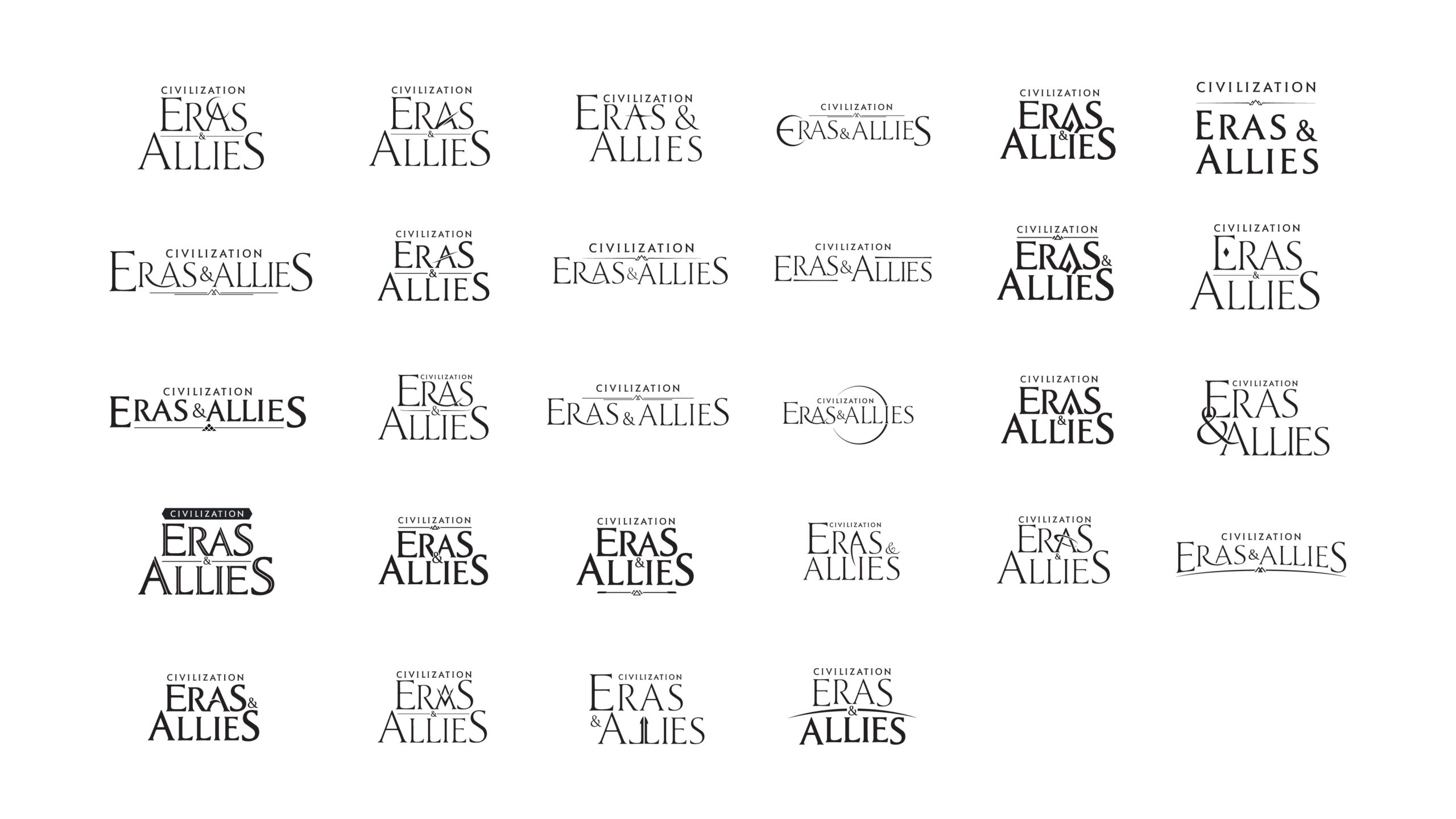
My process follows: Explore Broadly → Filter & Focus → Polish & Perfect.
Each variation you see is a result of strategic iteration based on direct client feedback—balancing aesthetic exploration with production requirements and gameplay context.
FINAL VERSION
Through rounds of iteration, critique, and typographic balancing, we arrived at a logo that met the client’s expectations:
• Elegant yet powerful
• Balanced in shape and scalable across mobile and digital platforms
• Visually aligned with the Civilization IP while standing apart from the core series
The final identity captures a blend of past and future, reflecting the core strategic and historical themes of the game.

GAME PREVIEW GRAPHICS
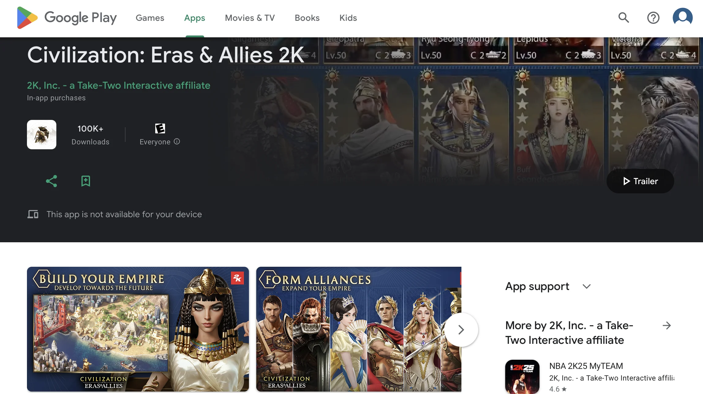
For Google Play & App Store
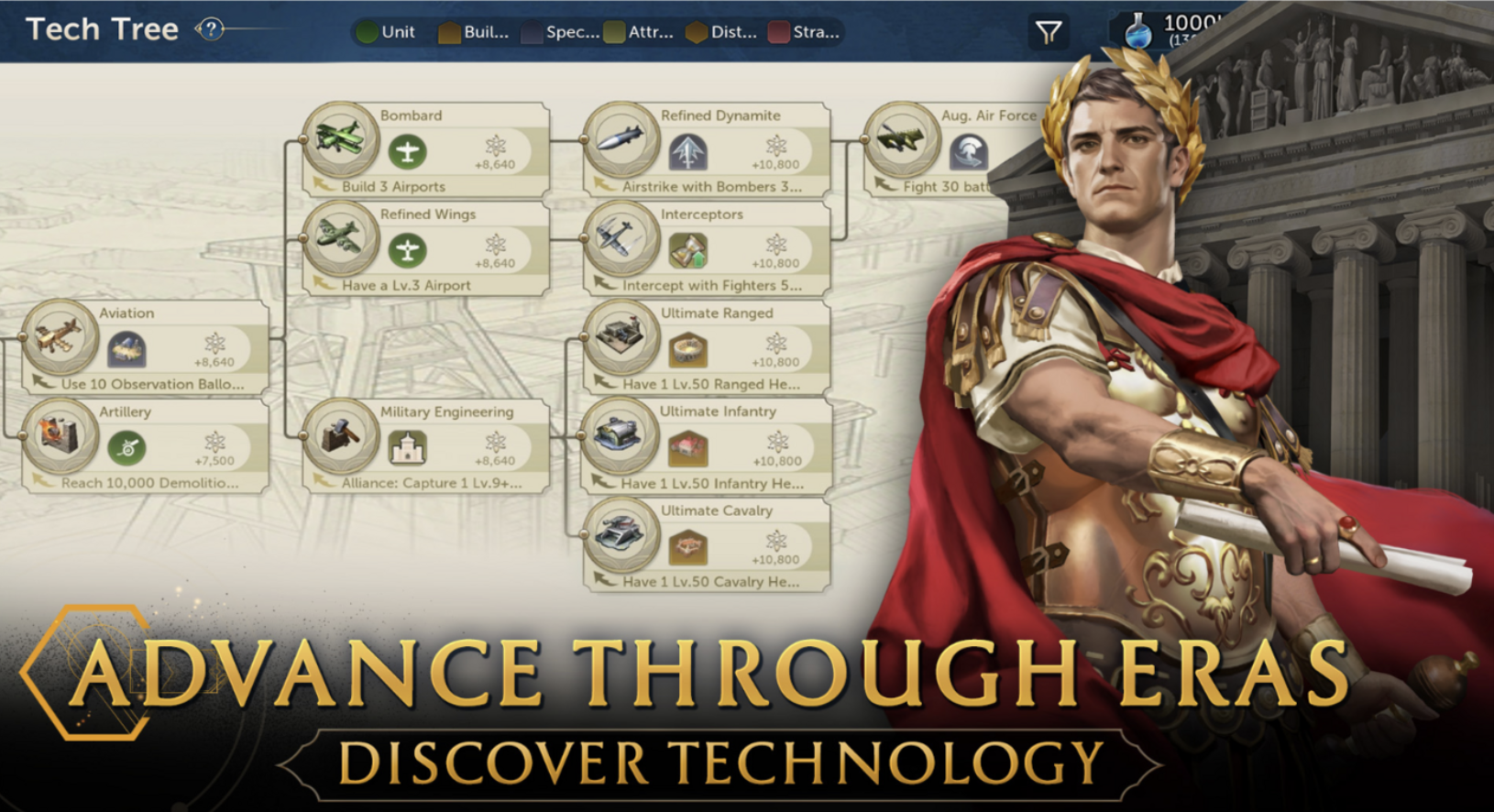
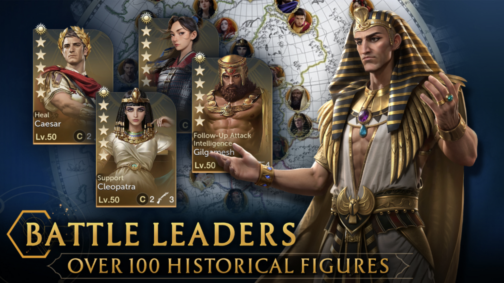
This preview is designed to give gamers a quick, essential understanding of the game. It’s crucial to highlight the best features to capture their attention and motivate them to dive in.
HOW WE DO IT?
Before
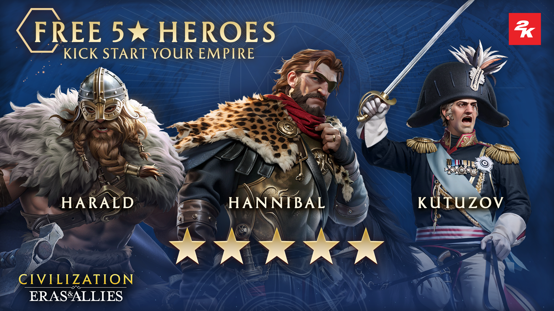
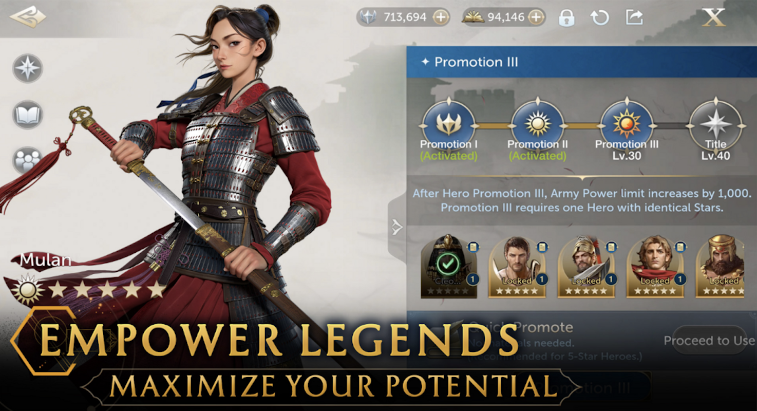
To draw immediate attention to the feature and enhance its impact, we refined the visual hierarchy by enlarging the stars and removing unnecessary clutter.
Before
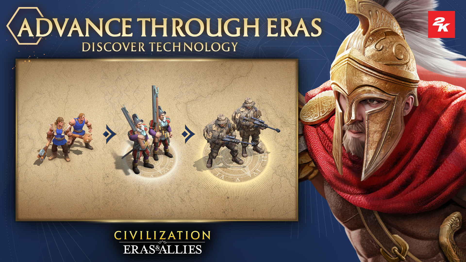
We use Pheidippides to symbolize players racing through the ages, while technology continually evolves and progresses.
Pheidippides: the messenger who ran from Athens to Sparta asking for help
Before
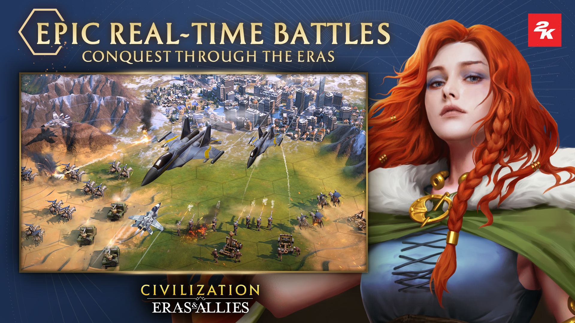
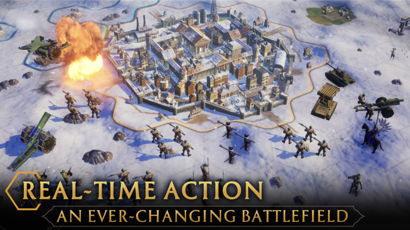
We updated the battlefield image to better represent modern warfare, featuring the female character Boudica to highlight courage and strength.
Before
We showcase a variety of 5-star Hero Cards, highlighting the ‘Battle’ with a stronger ‘versus’ feel to give users a clear sense of the combat dynamics.
