
New Roguelike Mode
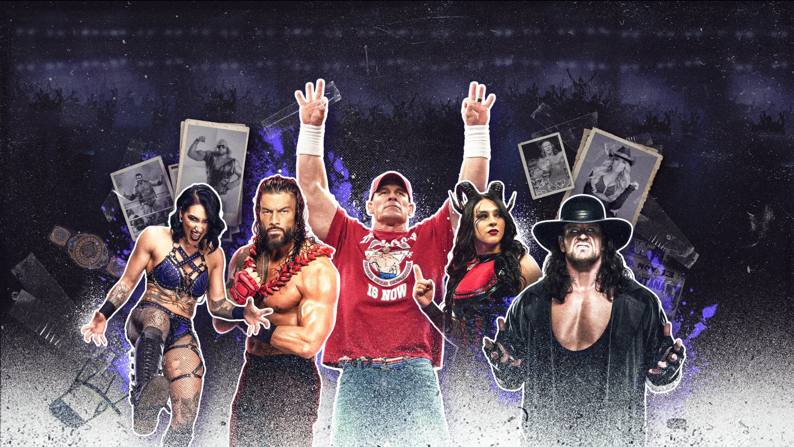
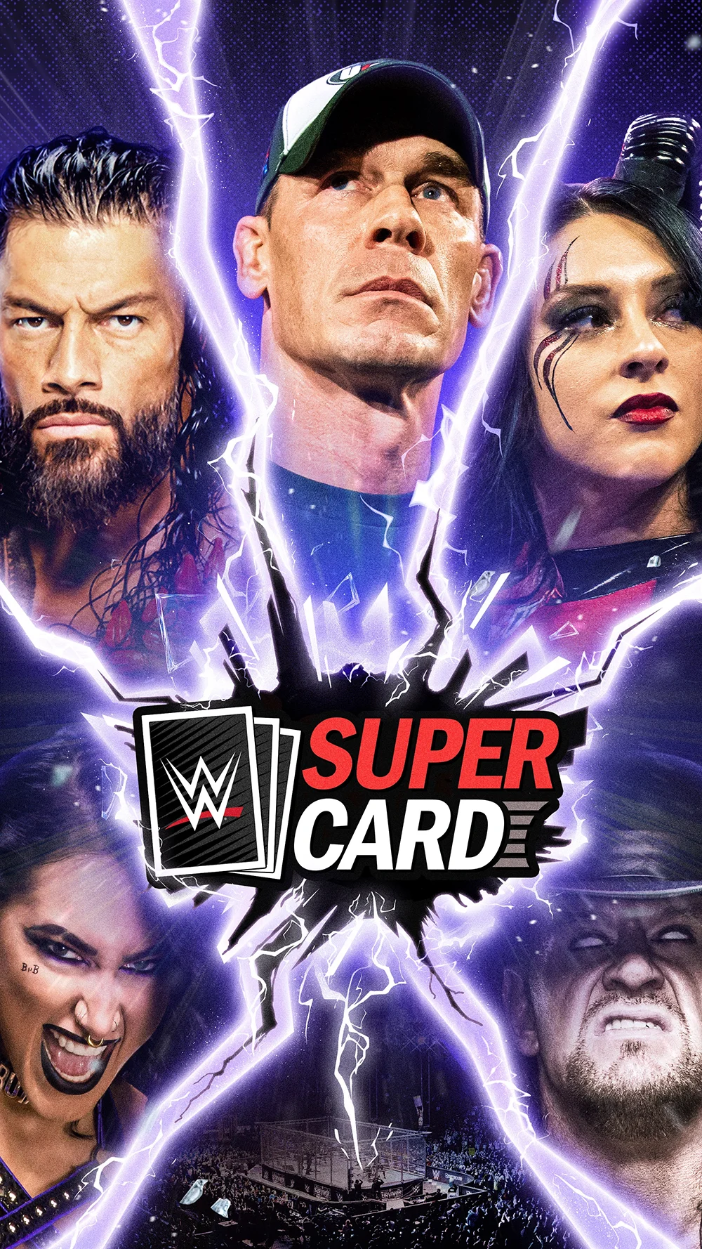
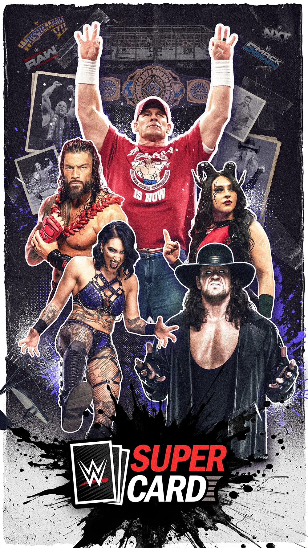
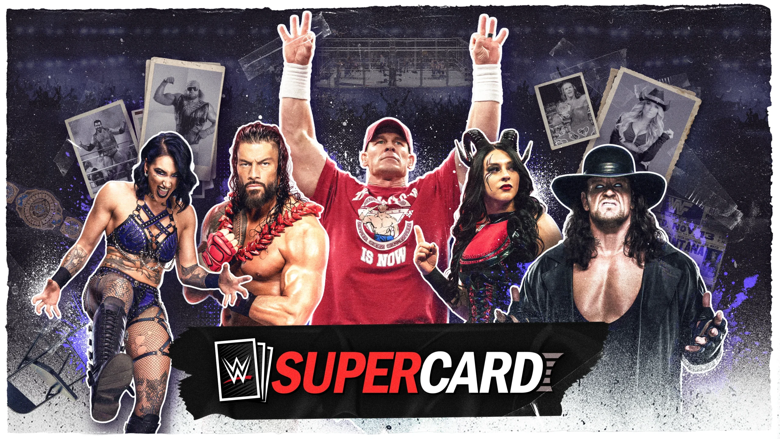
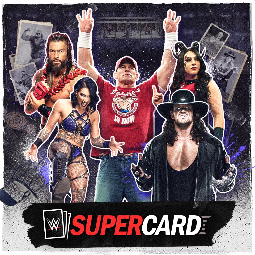
WWE Supercard Keyart
WWE SuperCard introduced a new roguelike mode called SuperShowDown, built around a run-based loop: Play Round, Earn Rewards, Improve Deck. I designed a key art system that communicates premium realism, strong energy, and clear focal hierarchy across store, social, and in-game placements.
The client preferred the grouped-talent layout style from their 2K26 reference, with additional inspiration from RAW and The Quarry for layered depth and perspective.
Project at a glance
Type: Mobile game keyart system
Goal: Introduce SuperShowDown mode, premium realism, strong hierarchy
Scope: 3 rounds of iteration, multi-format exports
Tools: Photoshop, Illustrator
Clients
Deliverables
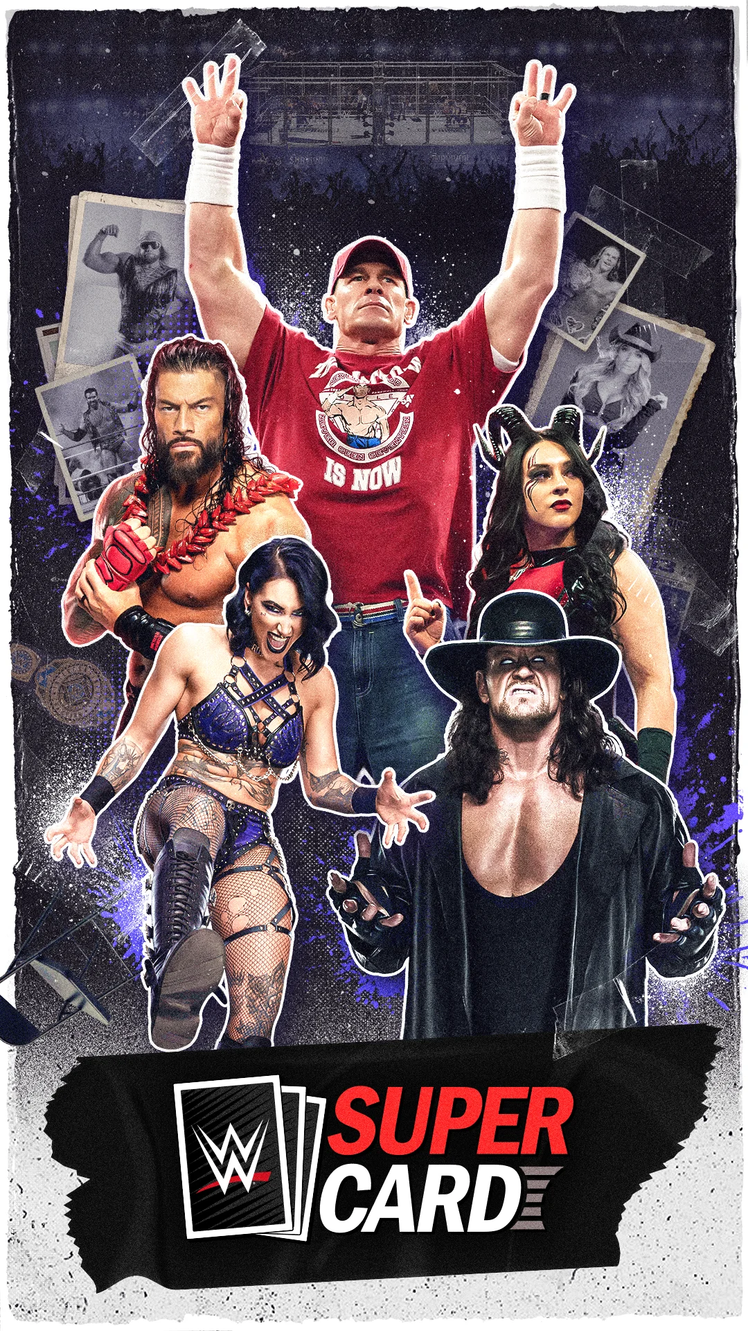
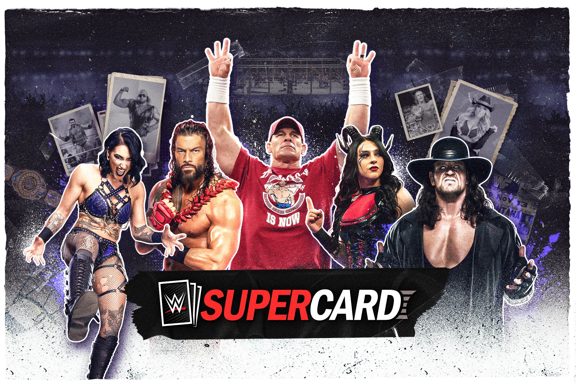
Final key art system delivered in:
2160×3840 (vertical)
3840×2160 (landscape)
1080×1920 (story)
1920×1080 (web feature)
1080×1080 (square)
1024×500 (banner)
My Role
Senior Graphic Designer
(compositing, layout exploration, production exports)
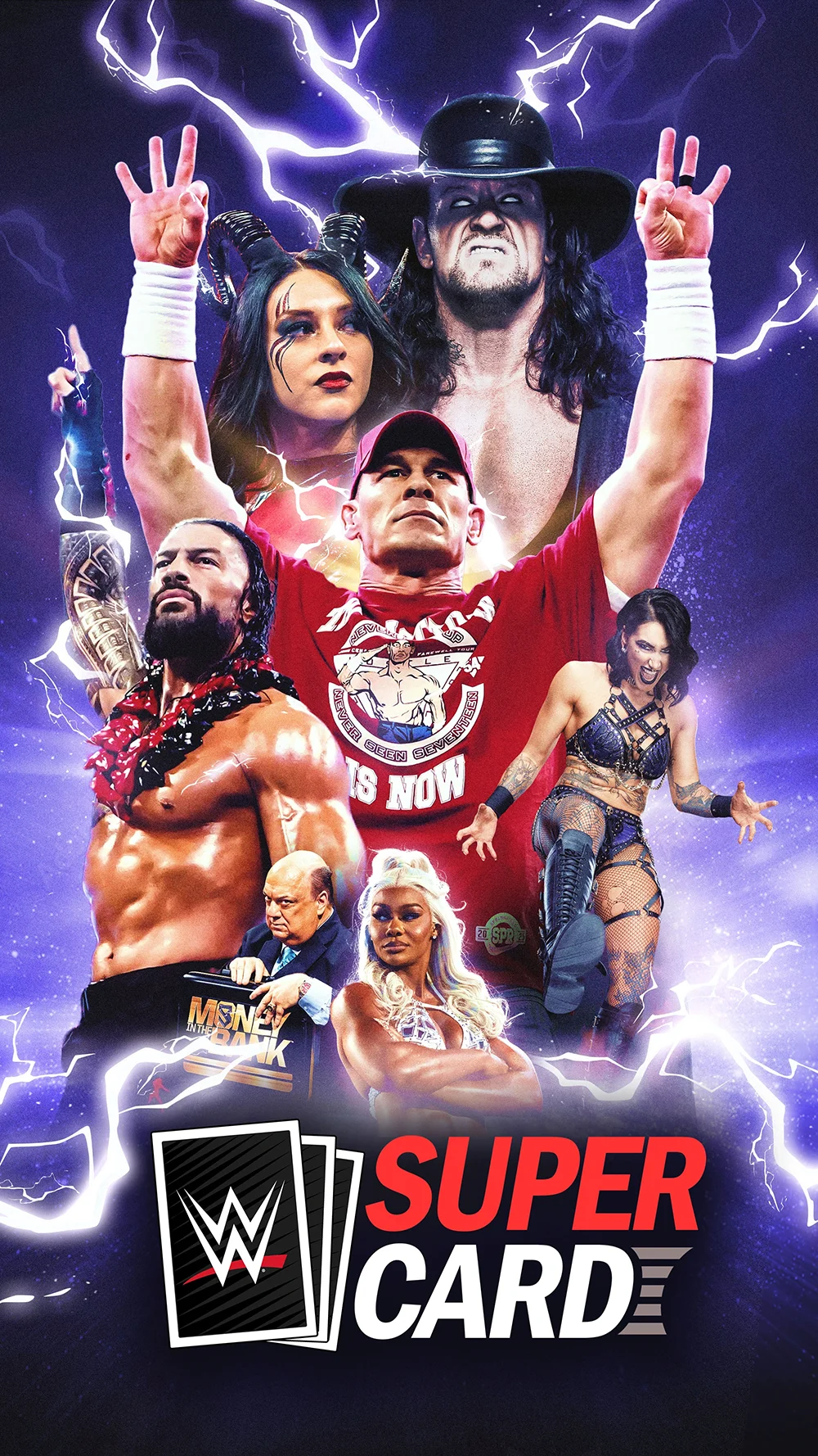
Round 1, Exploration
Concept A – Monumental Hero Stack
Concept B – Shadow & Myth
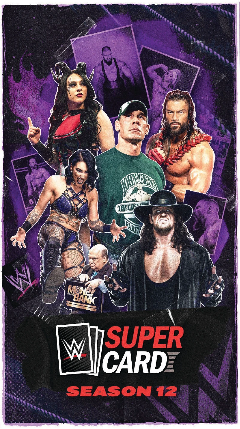
Concept C – Warriors Assemble
Concept D – Super Card Spotlight
Concept E – Hero in Frame
I explored multiple compositions focused on grouping, depth, and hierarchy. The goal was to find the strongest read at both large sizes and small sizes while staying aligned with the client’s preferred reference direction.
I experimented with various group stack compositions, foreground-background separation to enhance cinematic depth, title placement for improved readability when cropped, and refined focal strategies to ensure the main hero remains the focal point.
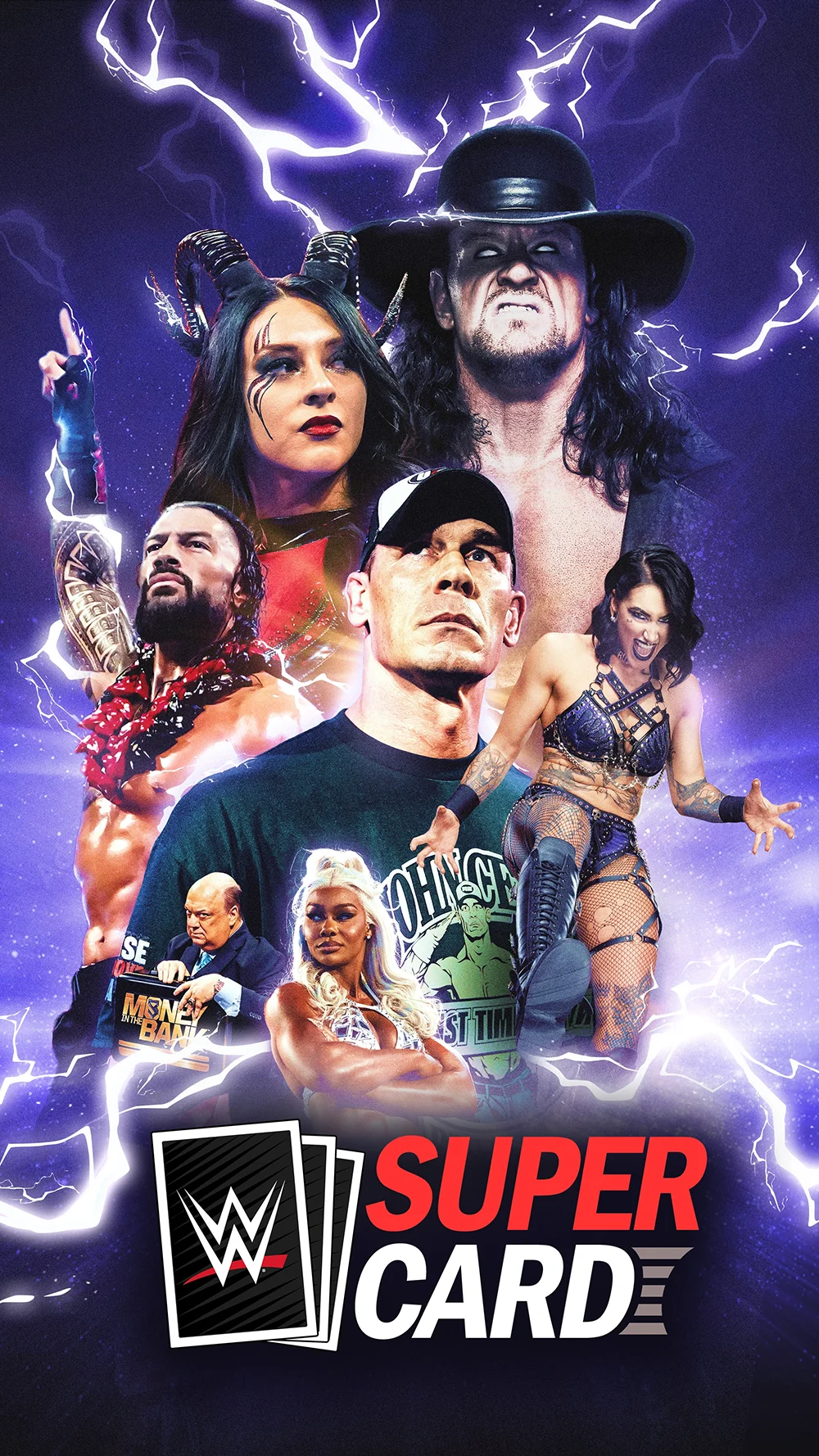
Round 2, Revision & More Exploration
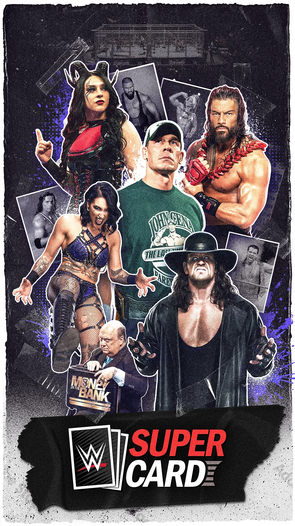
Concept C1 – Warriors Assemble
Concept F – Lightning Titans
Concept G1 – Thunder Arrival
Concept G2 – Thunder Arrival 2
Based on feedback, I narrowed down to the strongest layouts and improved clarity through hierarchy.
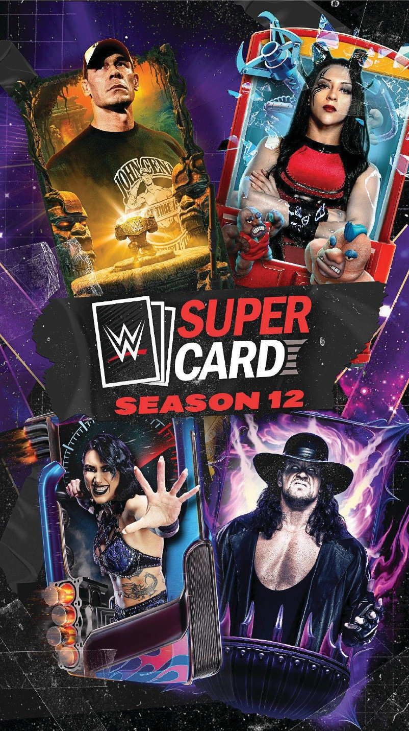
Additionally, clients wanted a see more exploration of the arts within the game, so I also tested these layouts.
- Re-arranged the player hierarchy so the user can simply tell who the main character is.
- Refined the grunge texture & paint elements to better suit the energy of WWE.
At this stage, I treated the composition like an audio control. If the background or secondary talent got too loud, the main player and title lost impact. Simplifying the environment made the main read stronger.
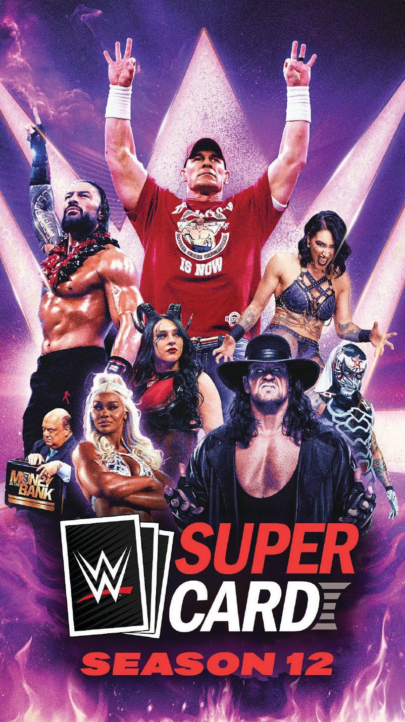
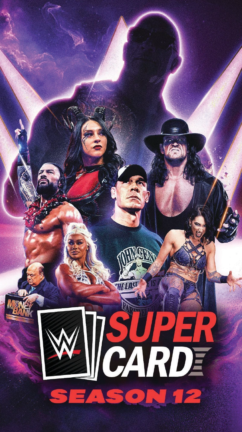
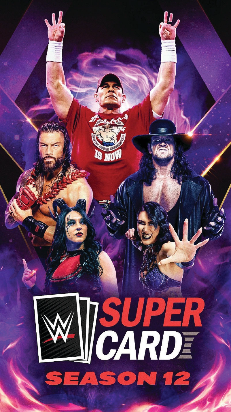
Round 3, Refinement
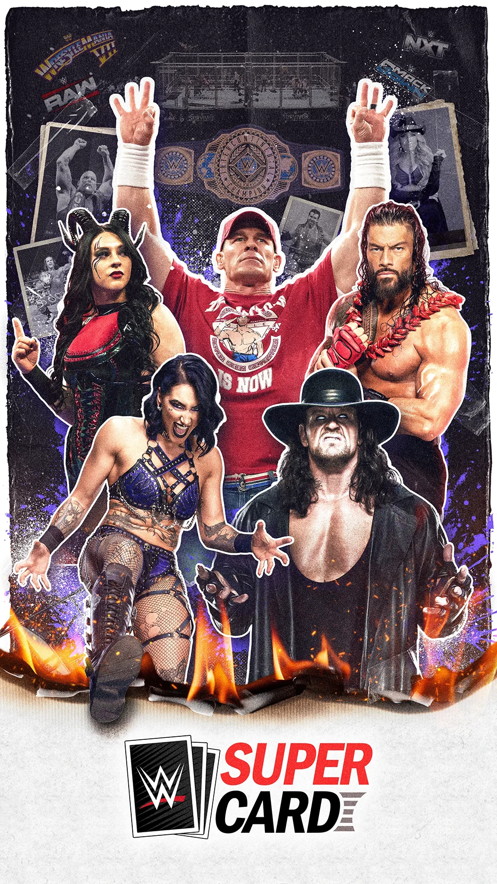
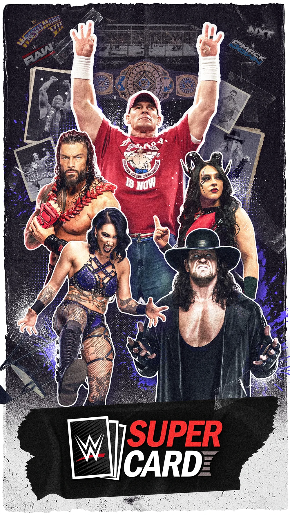
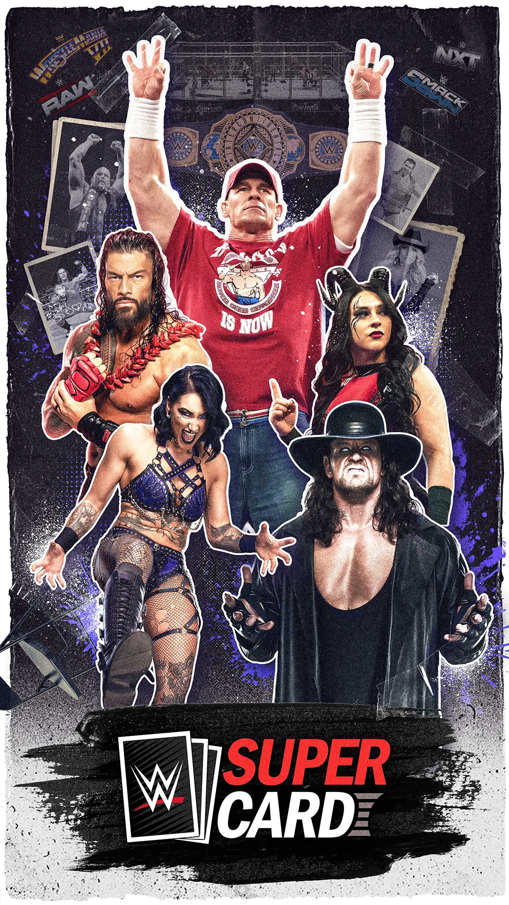
At this stage, most elements were locked. The client wanted to explore a more dramatic, energetic tilted treatment. While refining color balance and contrast for the final delivery to ensure strong readability and hierarchy, I also incorporated this tilted treatment into the composition.
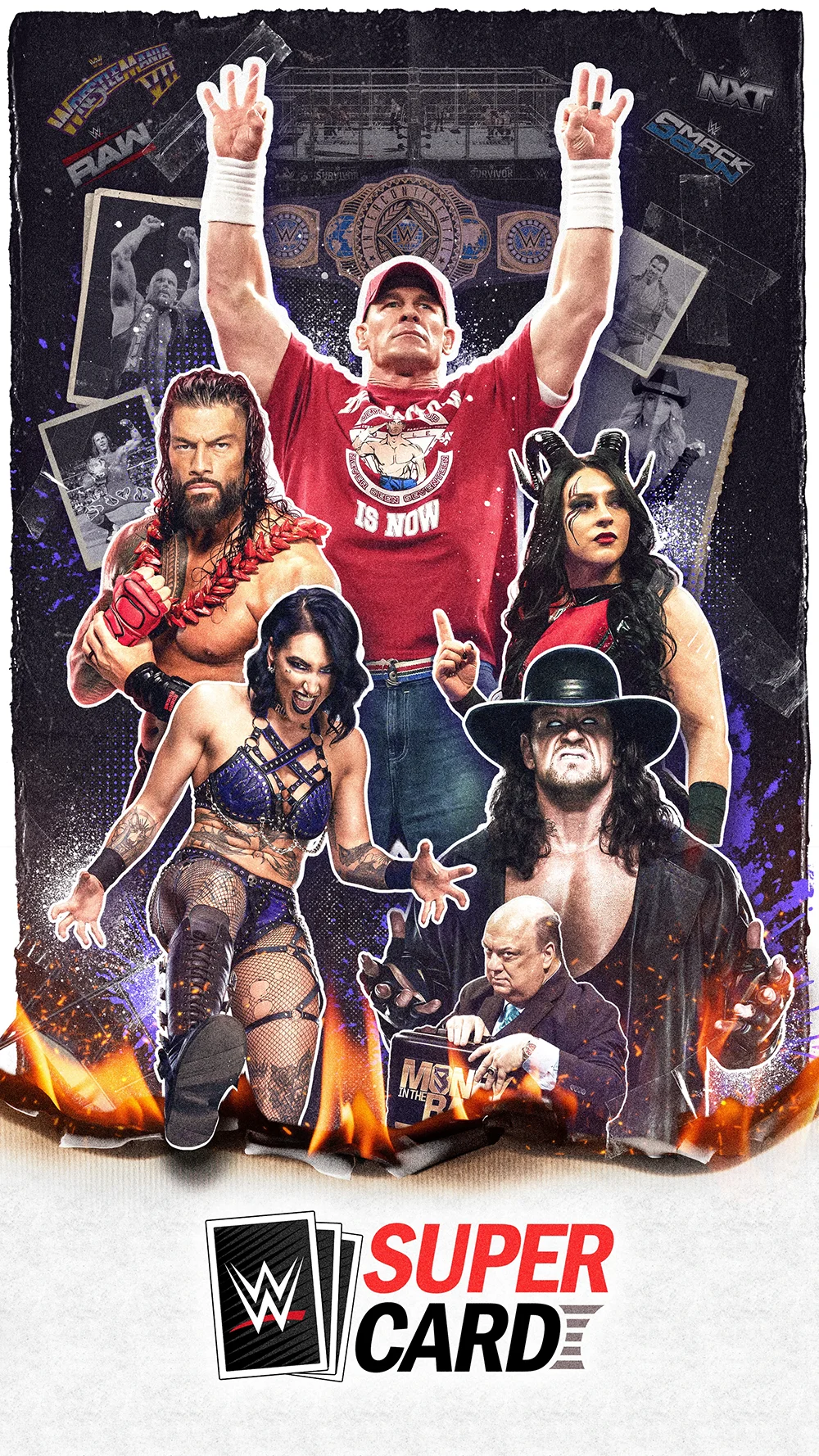
Final delivery, Multi-format system
Final Delivery
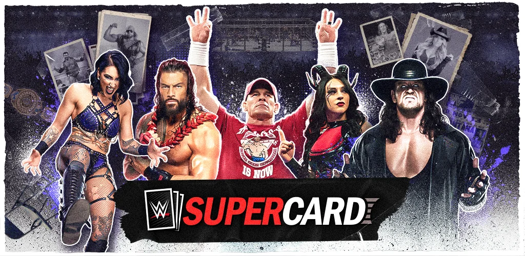
I exported a full set of production-ready formats so the team could put the assets directly into placements without any redesign, including vertical, landscape, square, and banner versions, all built with proper safe margins for marketing material overlays
Delivered a production-ready key art package for SuperShowDown across required placements. Exports included:
2160×3840 (vertical key art)
3840×2160 (landscape key art)
1080×1920 (story format)
1920×1080 (web feature)
1080×1080 (square tile)
1024×500 (banner placement)
Web Feature 1920×1080 (UI/web use)
