
DIGITAL
EXTREMES
Produced at
Hammer Creative
Producer
Kevin Miller
Art Director
Earl Burnley
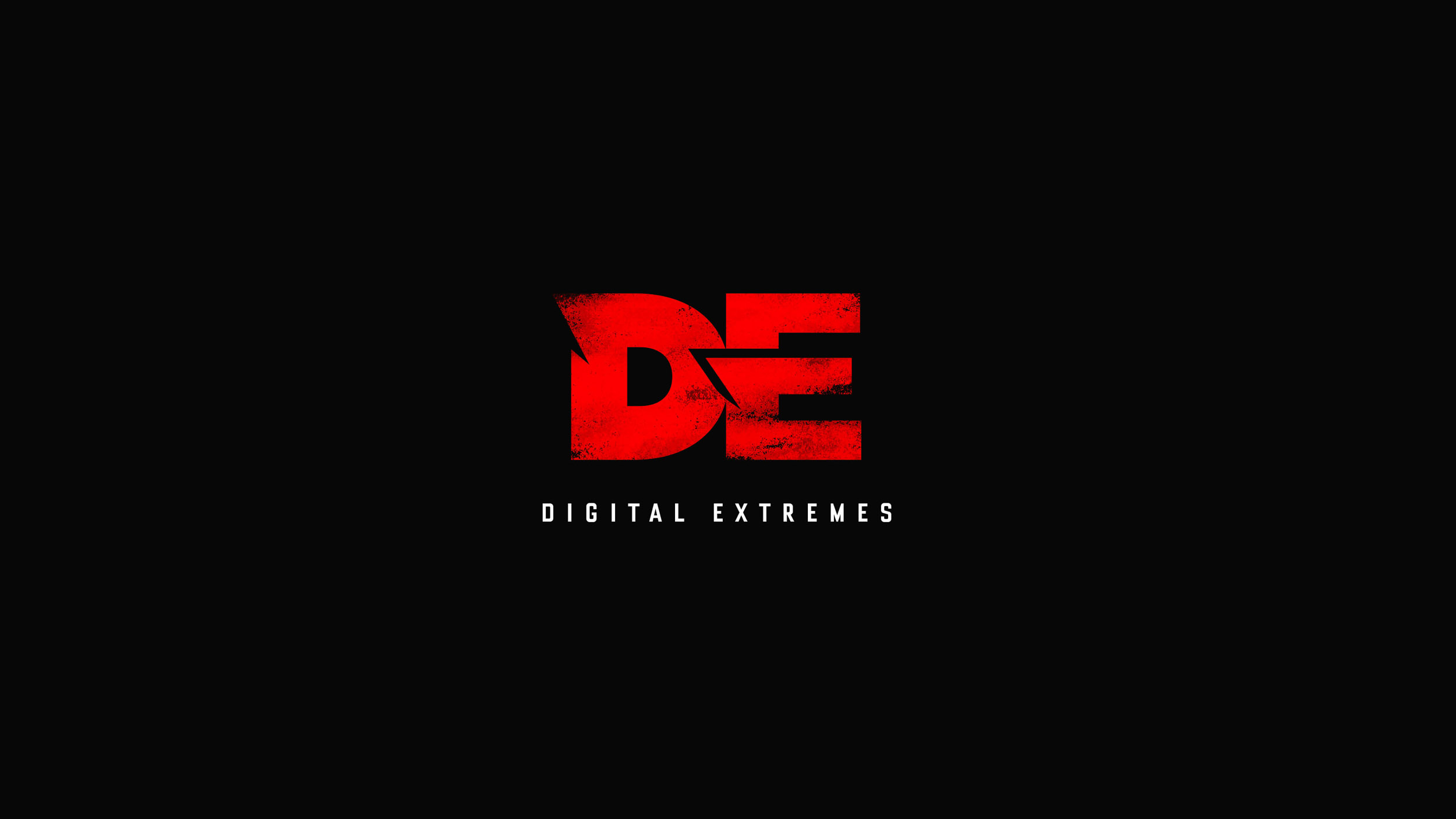
DIGITAL EXTREMES
DIGITAL EXTREMES is a game developer based in Ontario, Canada. It’s closely associated with the WARFRAME franchise, a free-to-play, online co-op fantasy action series taking place in space, which features overly ornate and complex design; clocking nearly 50 million in playership. Starting with EPIC PINBALL, their 27 year history includes the co-development of the UNREAL series with Epic Games, BioShock 2, The Darkness I, and Dark Sector (the
progenitor to Warframe). After those 27 years, Digital Extremes is seeing their brand running stagnant and is looking to shake things up. This led to the need to formally acknowledge themselves, by shorthand, simply as DE.
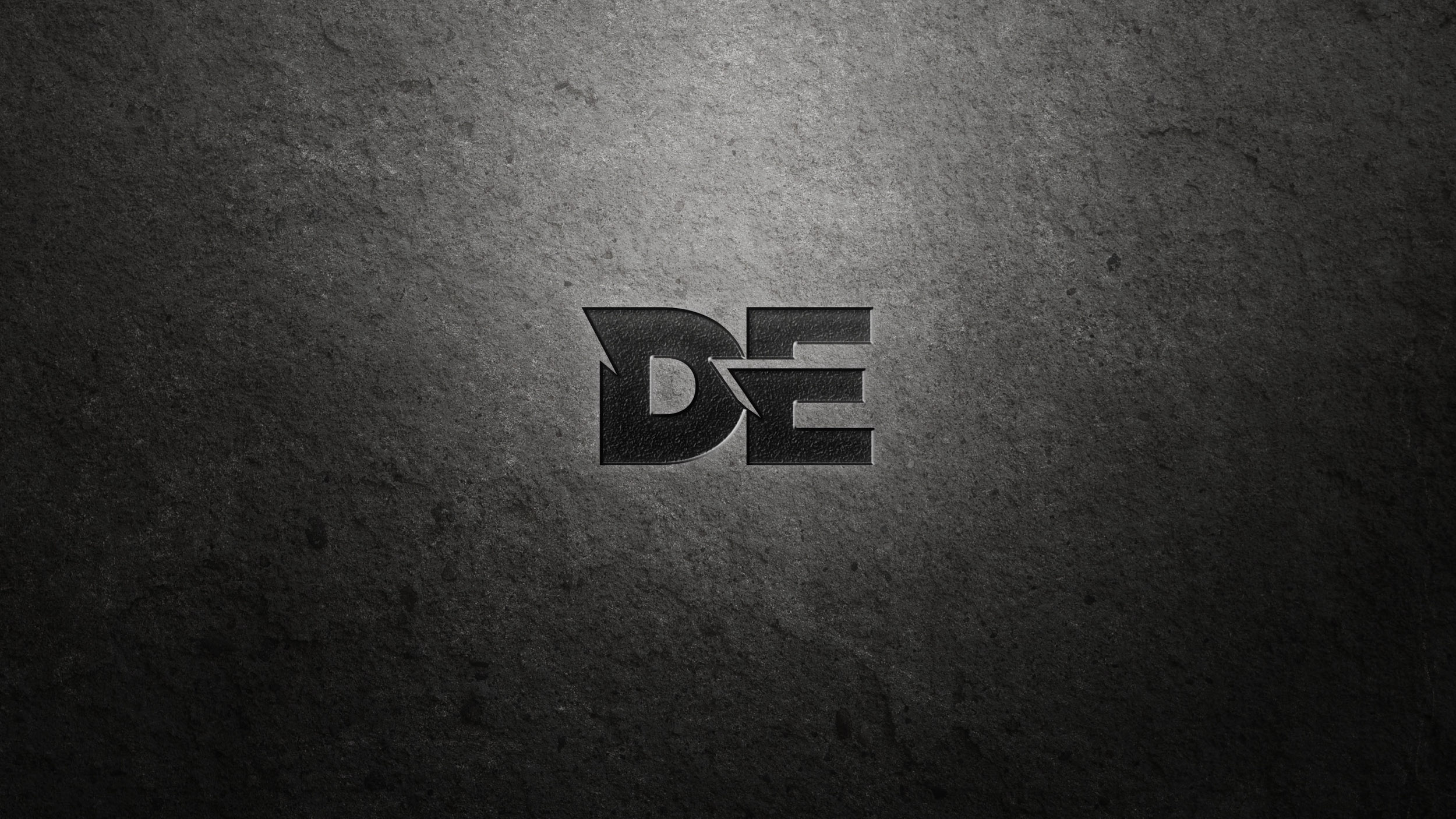
THE GOAL
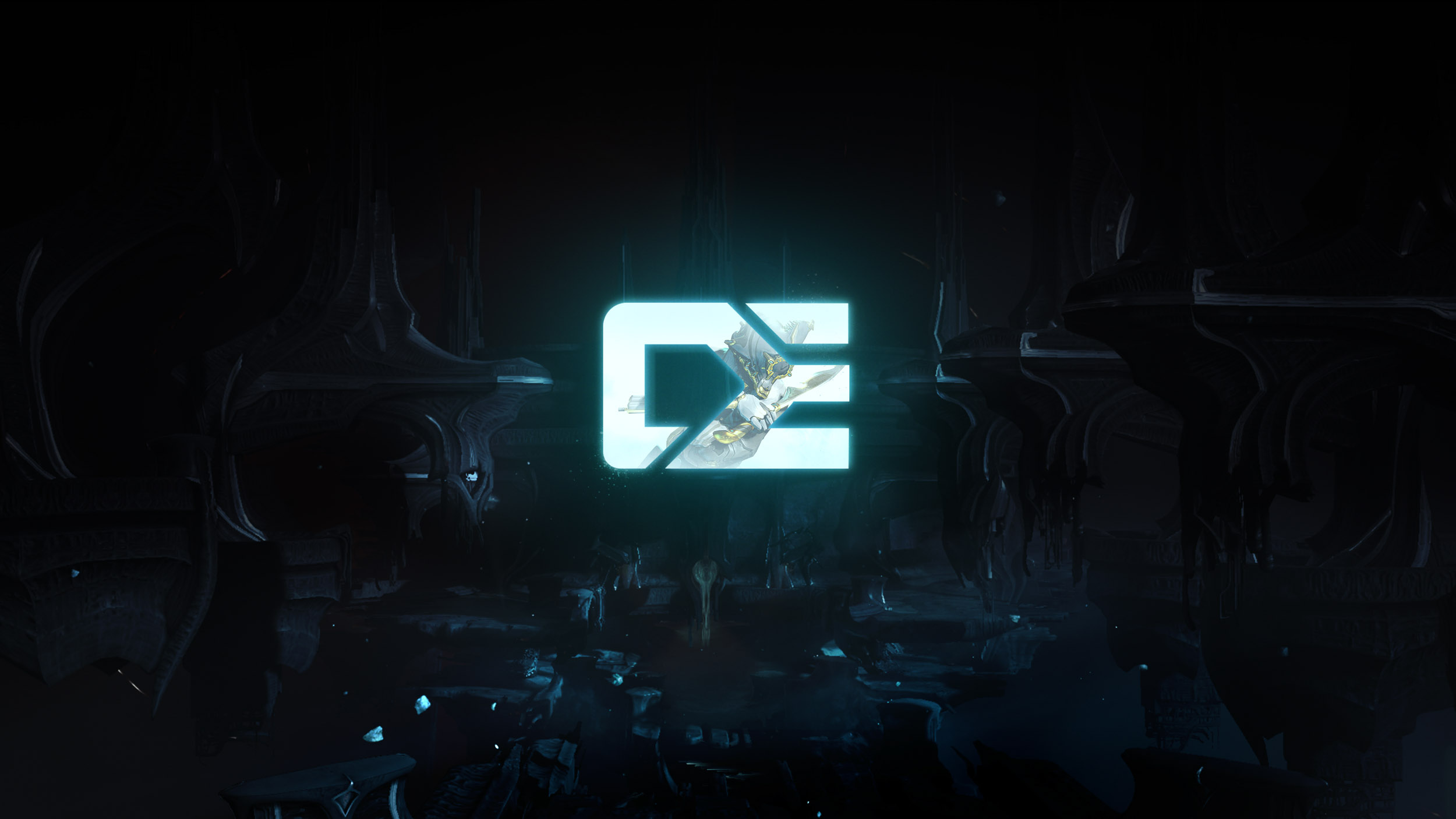
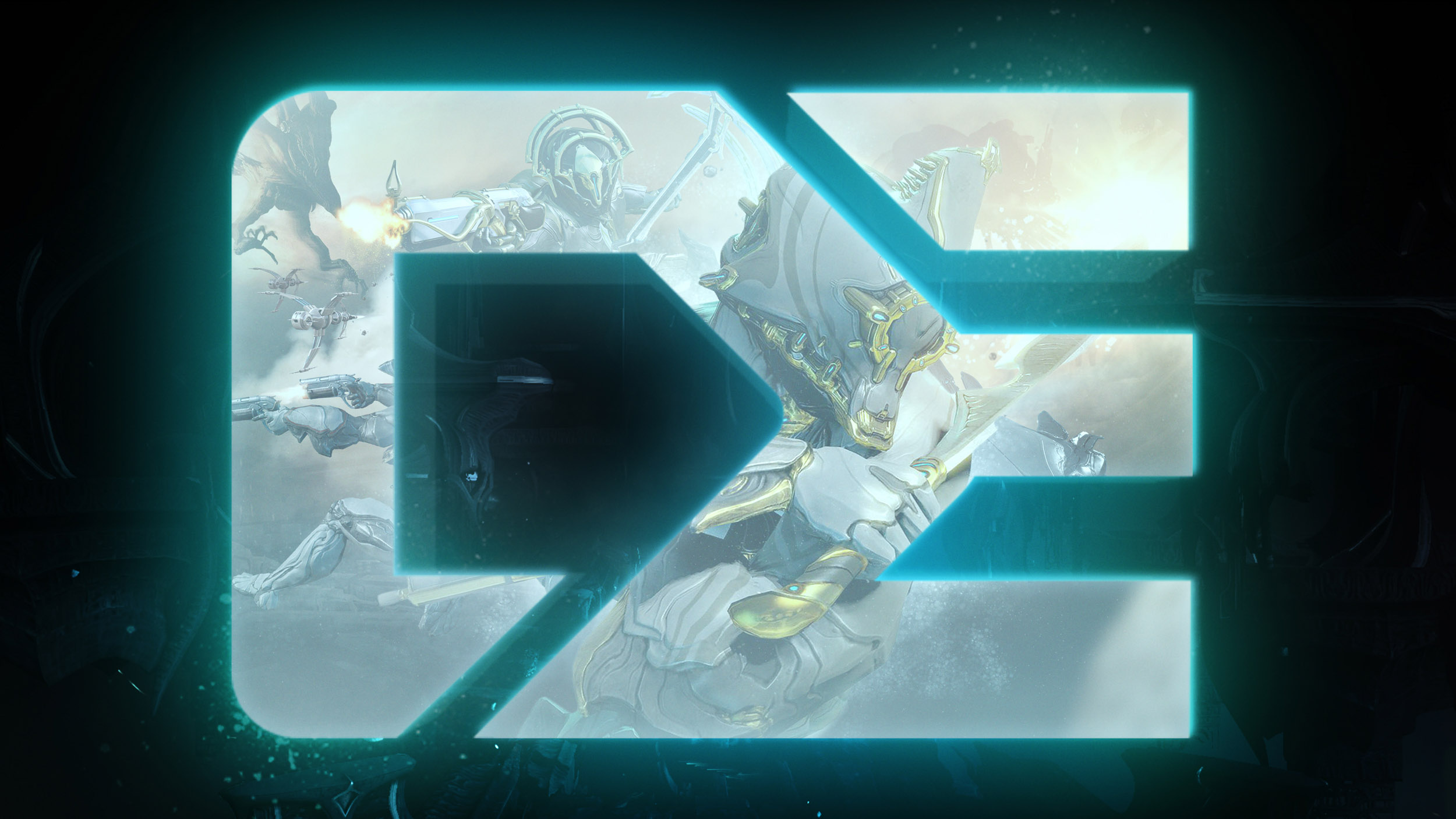
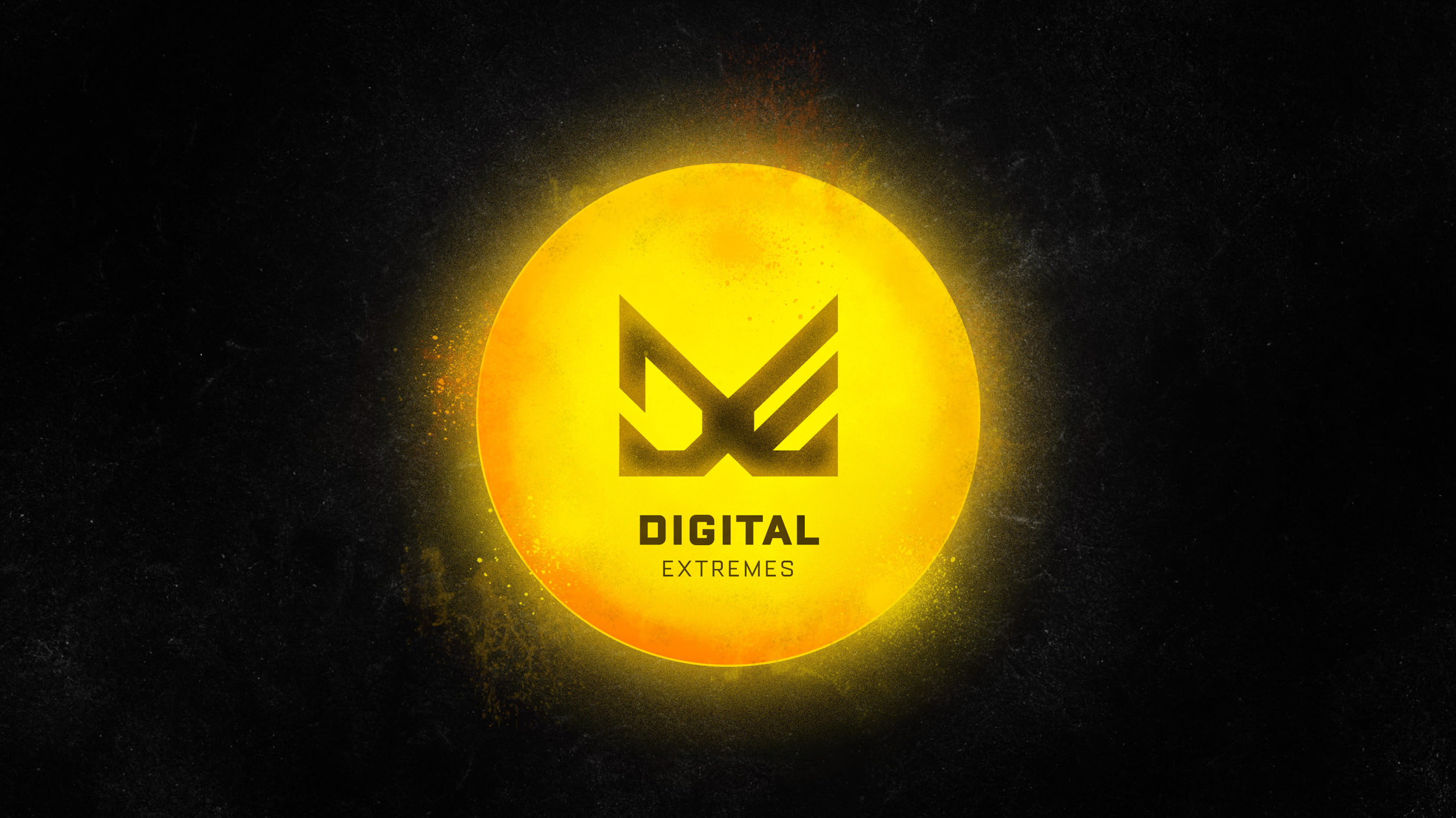
DE is seeking proposals to completely overhaul and rebuild their logo. Essentially we are devising ways to create a brand new logo from scratch. This logo will shepherd a refresh of Digital Extreme’s current identity into a new era as “DE.” The logo will symbolically pay homage to DE’s past accomplishments, their current success (in particular, WARFRAME), as it also looks toward the future. The goal is to achieve a logo that is read as iconic and is unique an ownable to a refreshed DE brand.
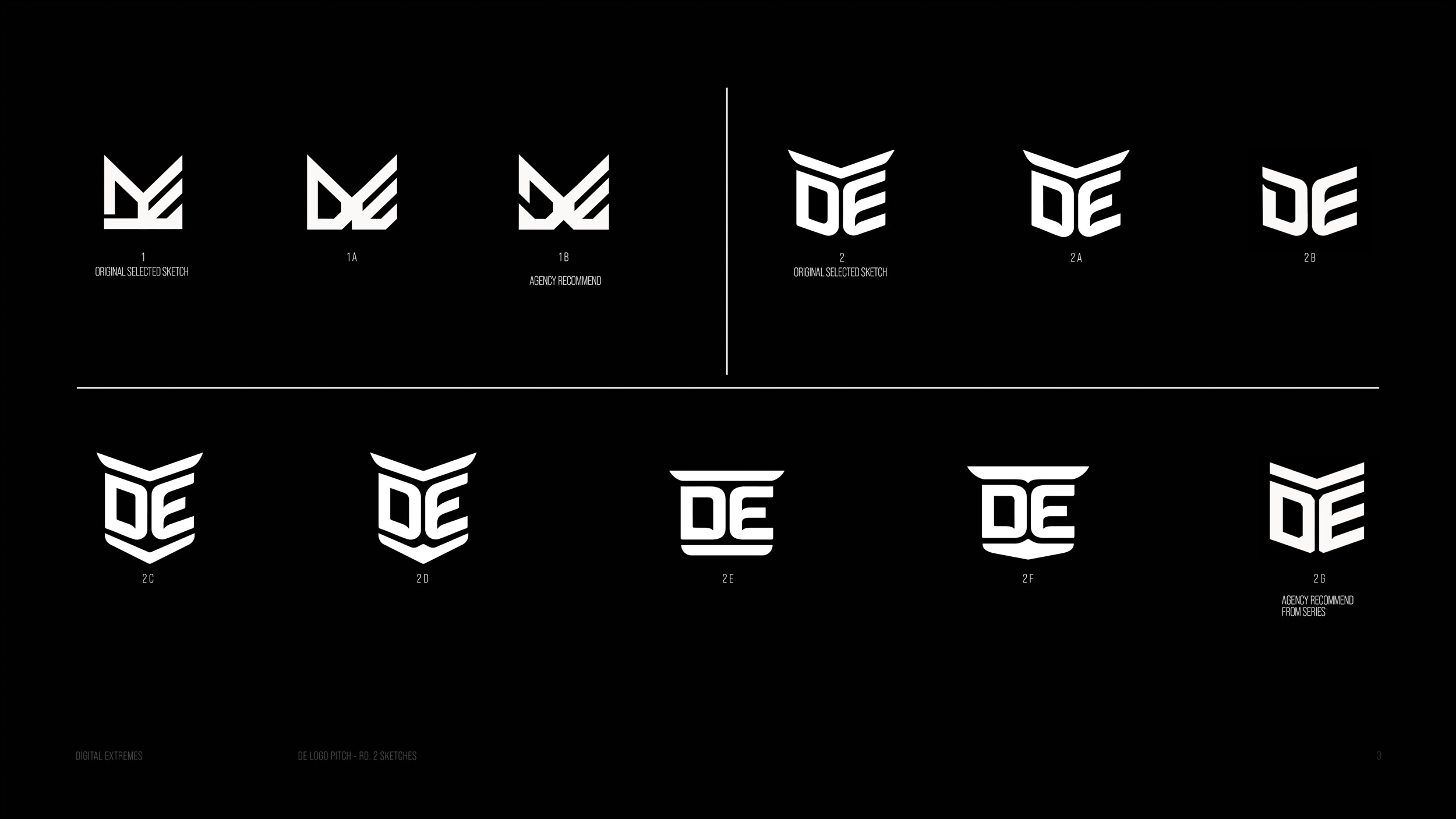
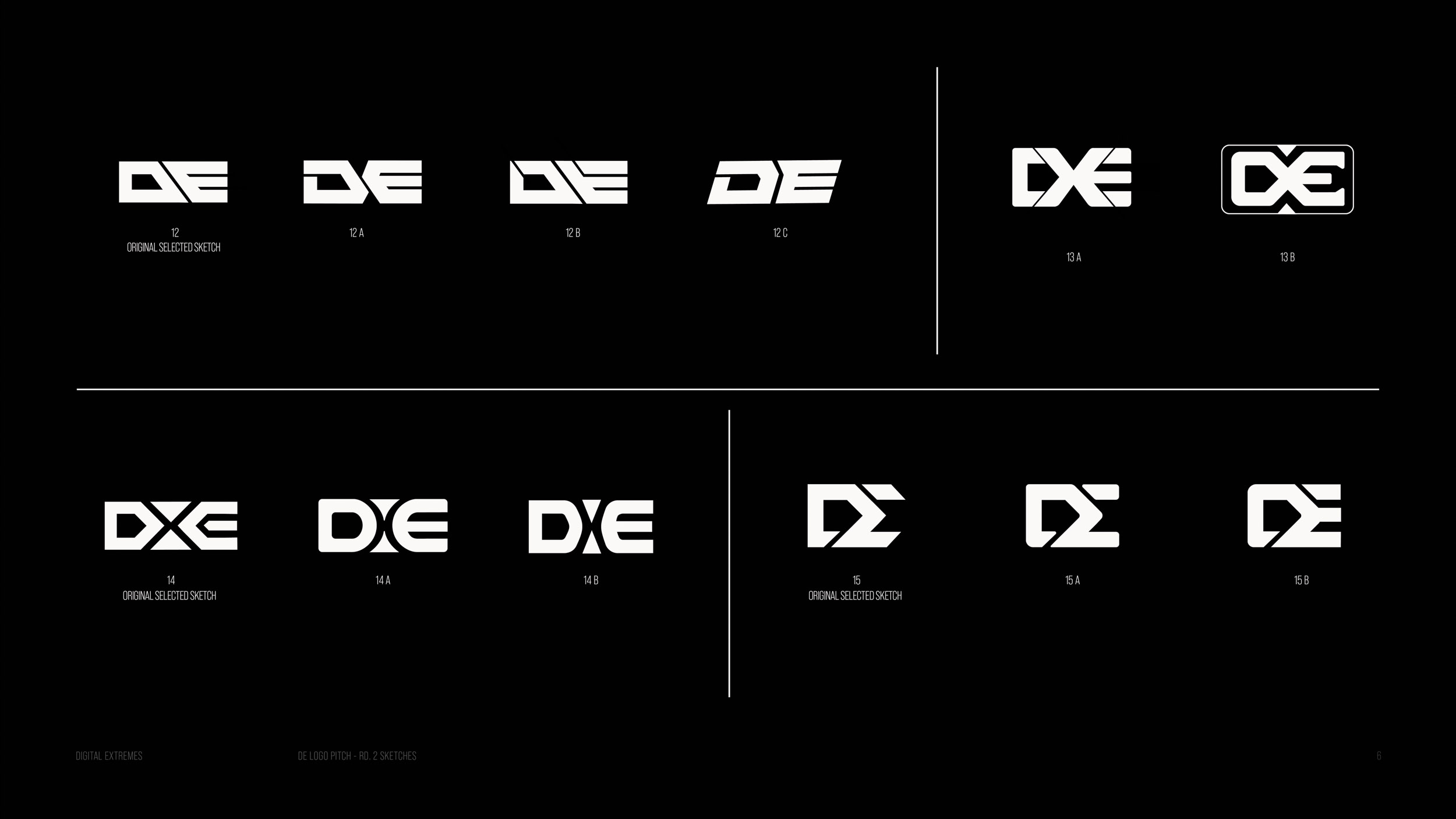
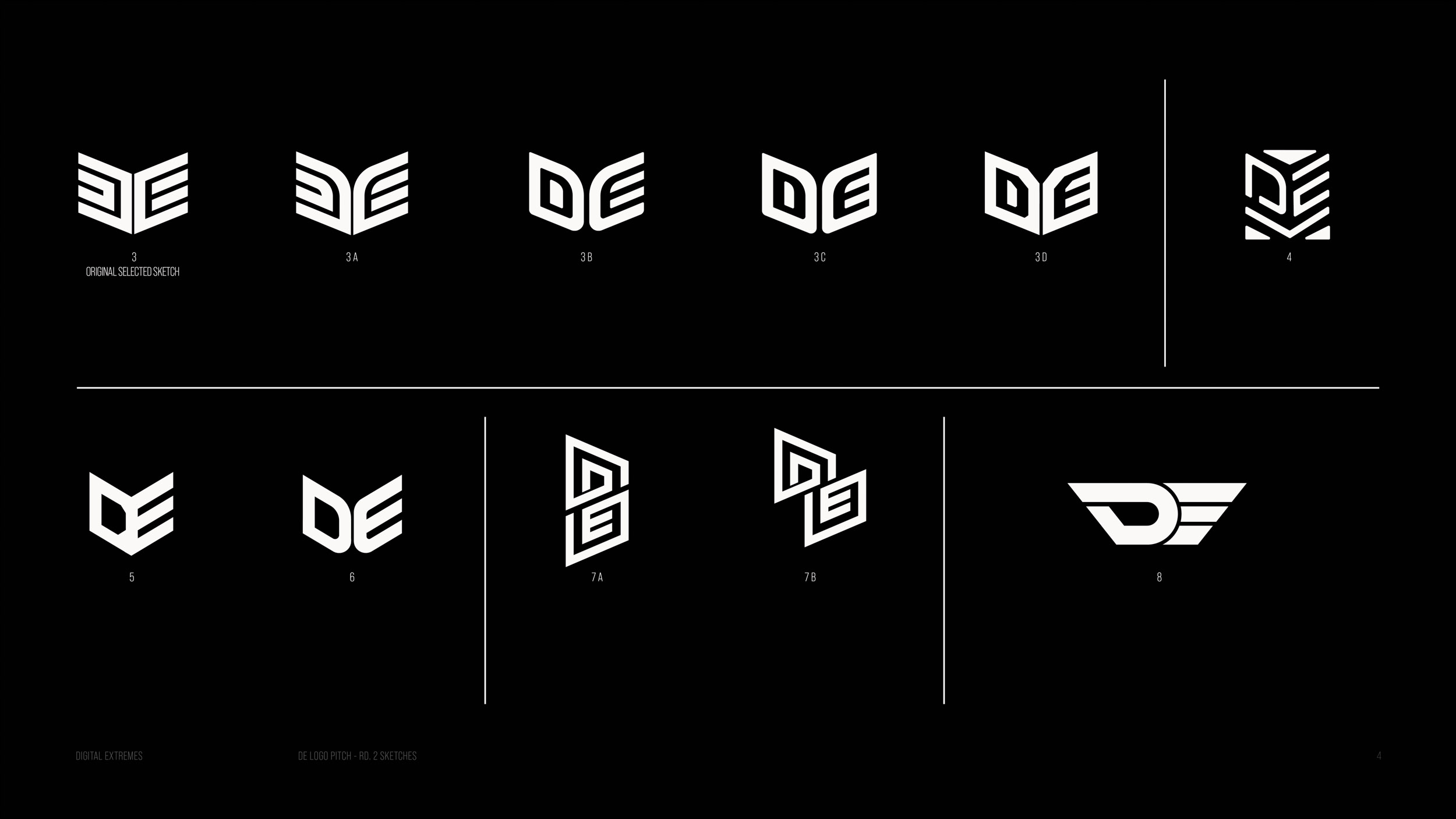
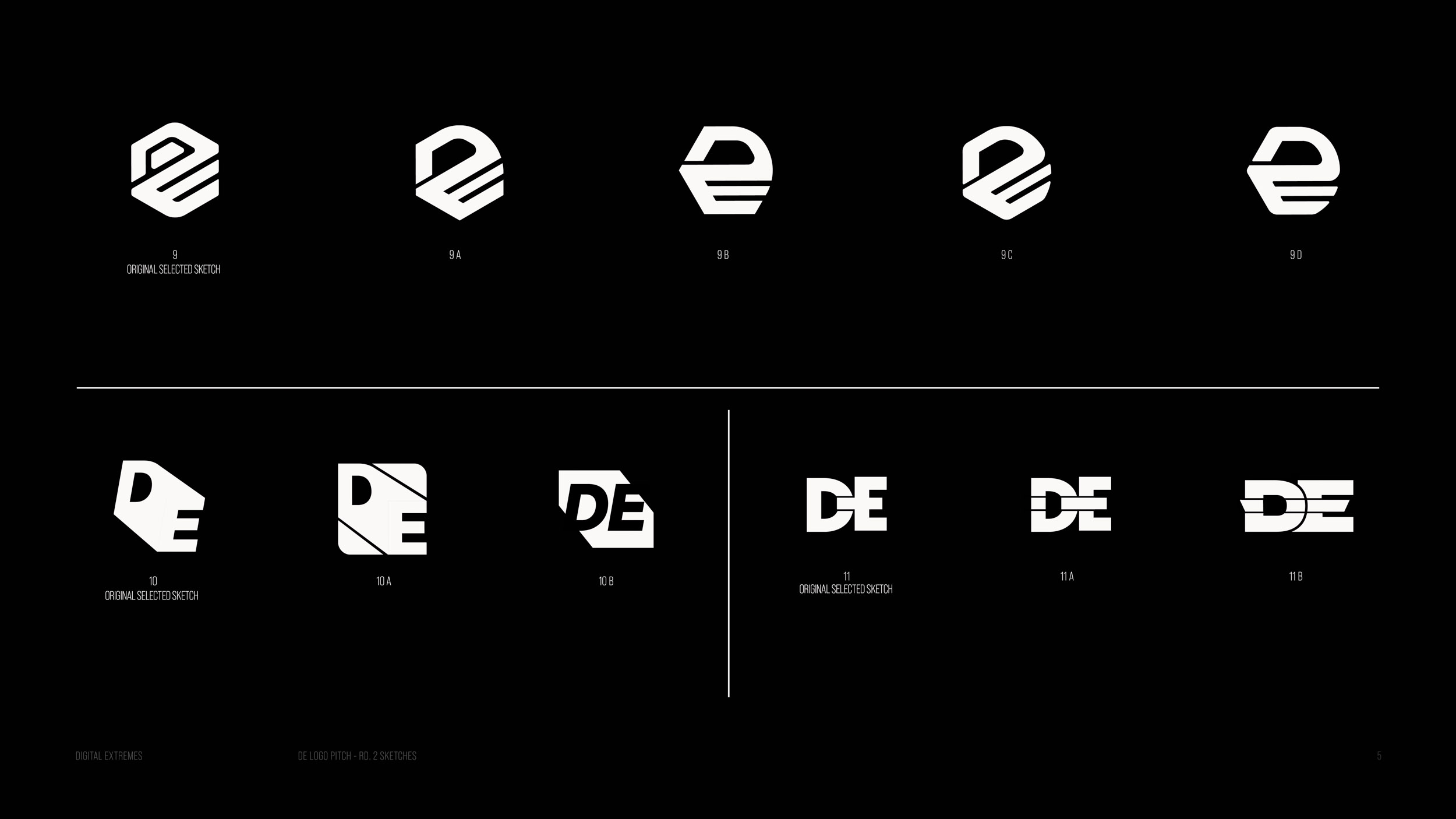
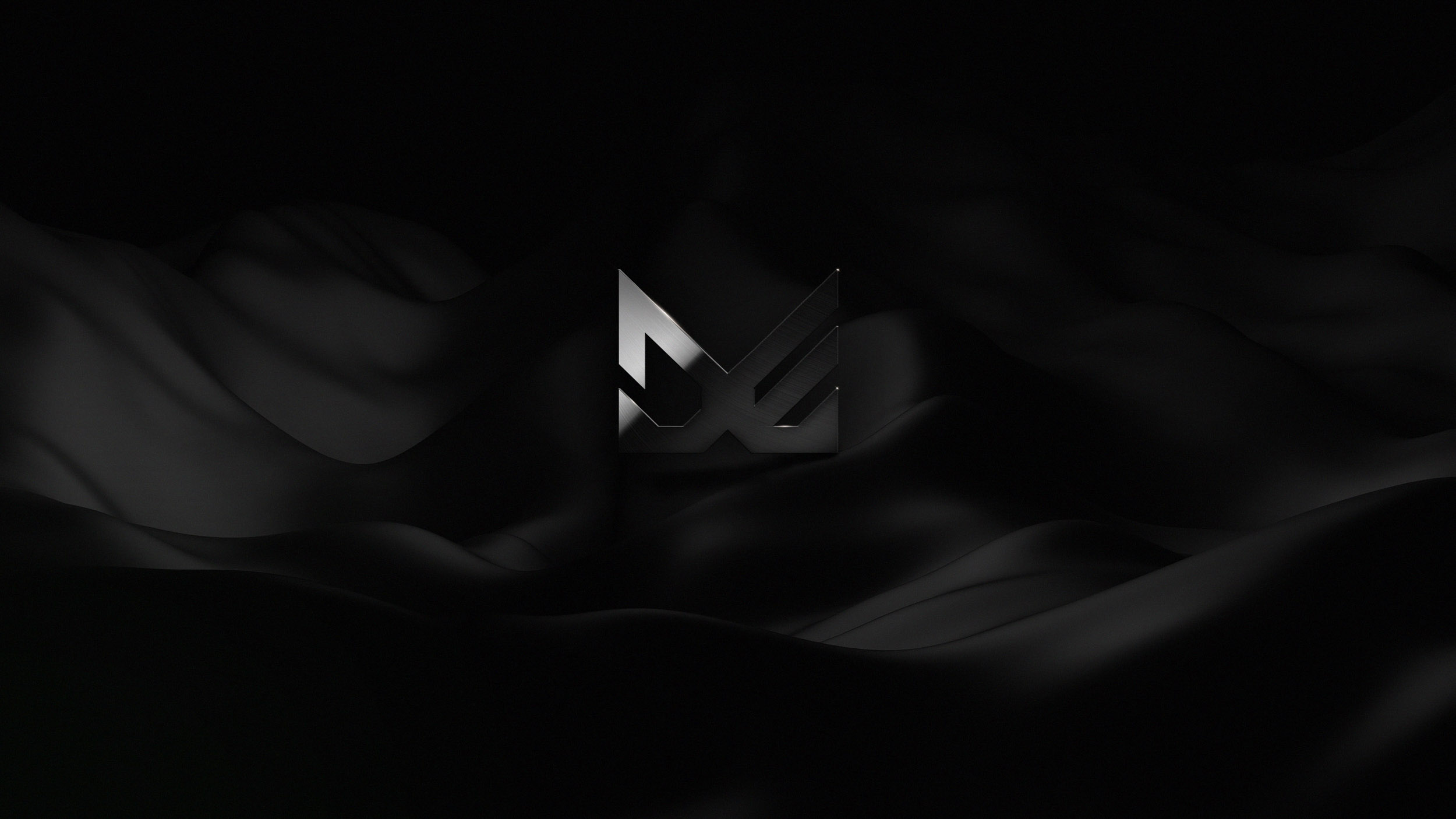
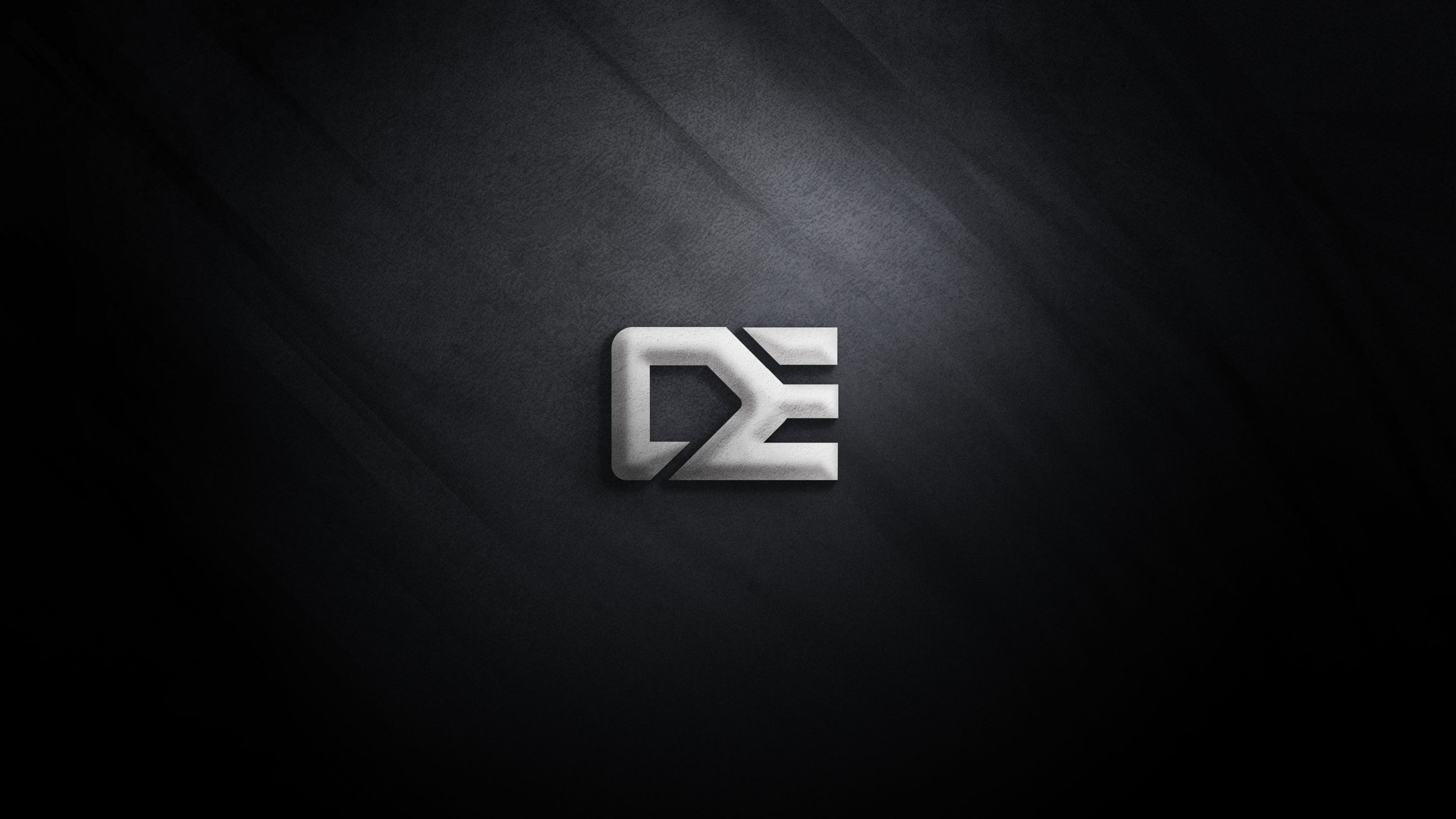
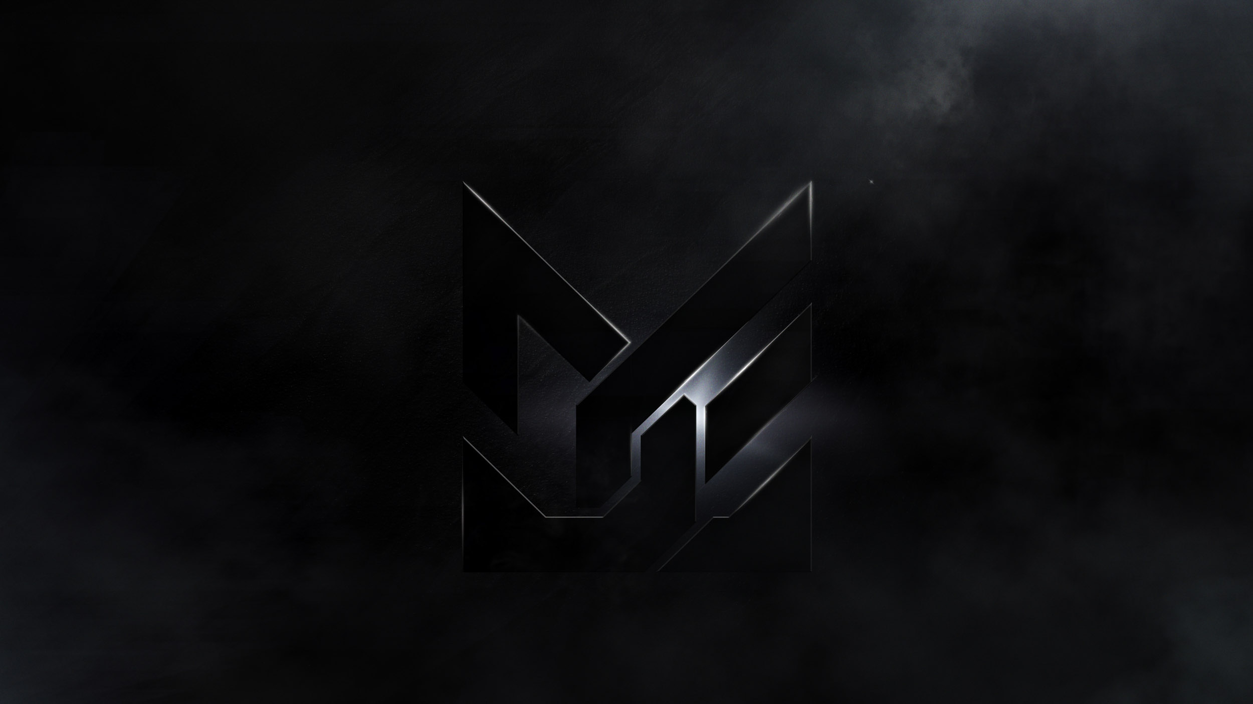
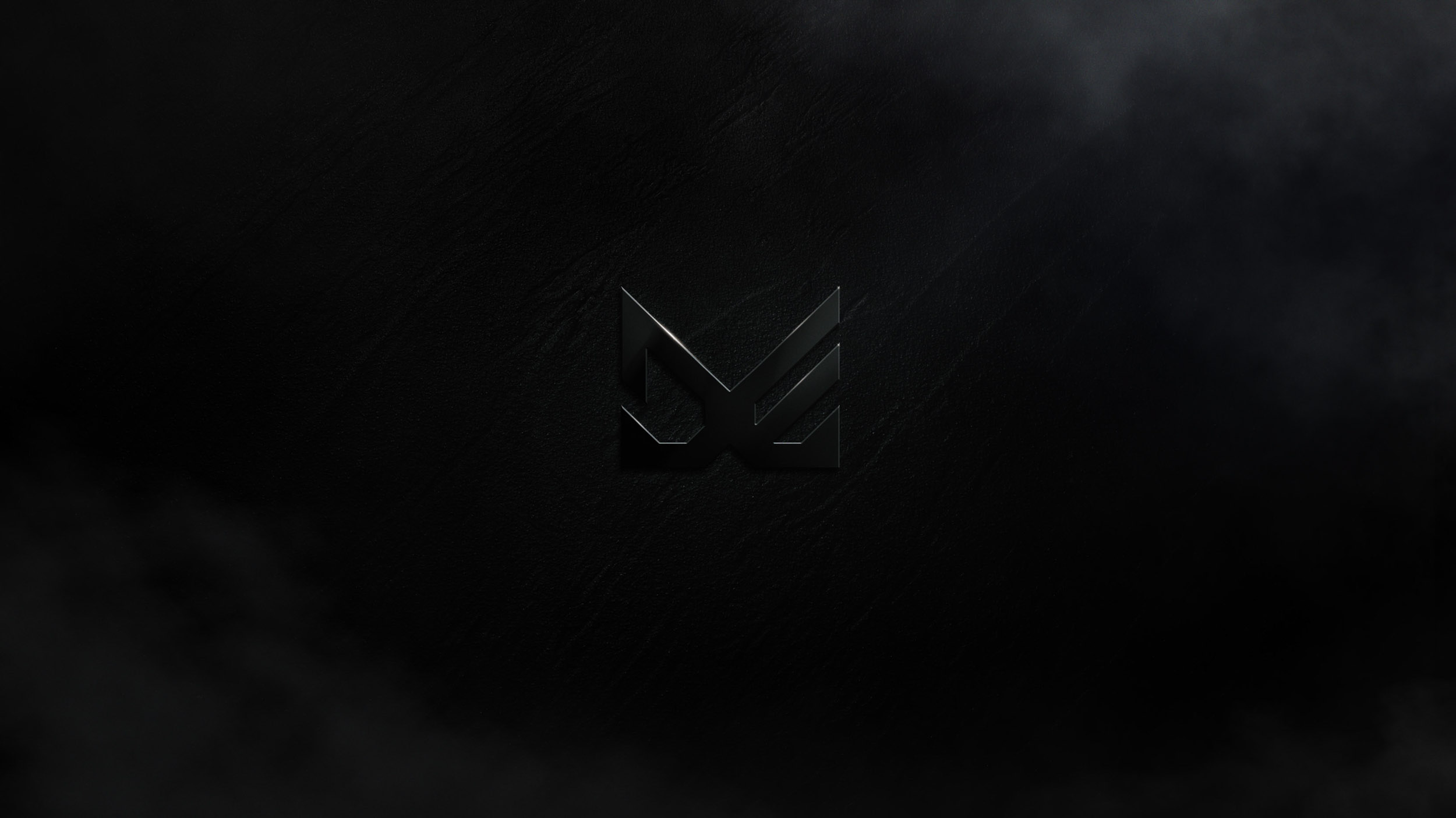
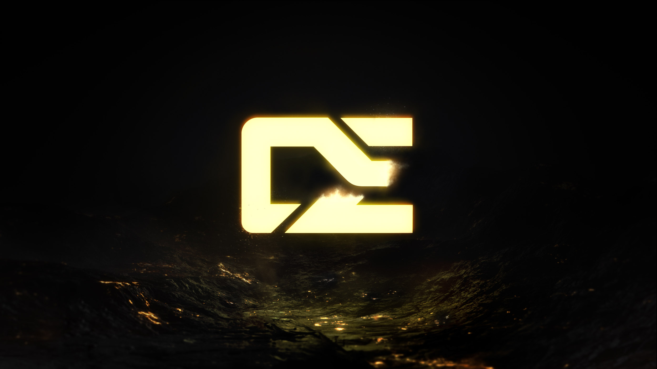
LOGO
SKETCHES
FURTHER INSIGHT &THOUGHTS
They use “DE” as a prefix to identify their employees (ie. DE_Rebecca) through online gaming and social media. This could suggest to add functionality to the logo where it could be set with other supporting text like names for tagging purposes. They also deemed themselves friendly (hence referencing staff members by first name), suggesting that their brand is approachable. A fixed branding manifesto has not been established and there aren’t direct plans to have one. In turn, they are open to many opportunities within certain parameters. DE is ready to move into a look that is “slick” and contemporary. All iterations up to the current logo feel dated. Despite the fact that they want to honor their past, they still want to be forward facing rather than experimenting with a “retro” look. This is to help imply that DE is a “modern day” gaming company and publisher and ready to extend their enterprise. We should put our energy to a logo that is either more horizontal or squarish in nature. This opens things up for application and functionality purposes. The current logo feels too vertical and limits the ways it can be applied and used.


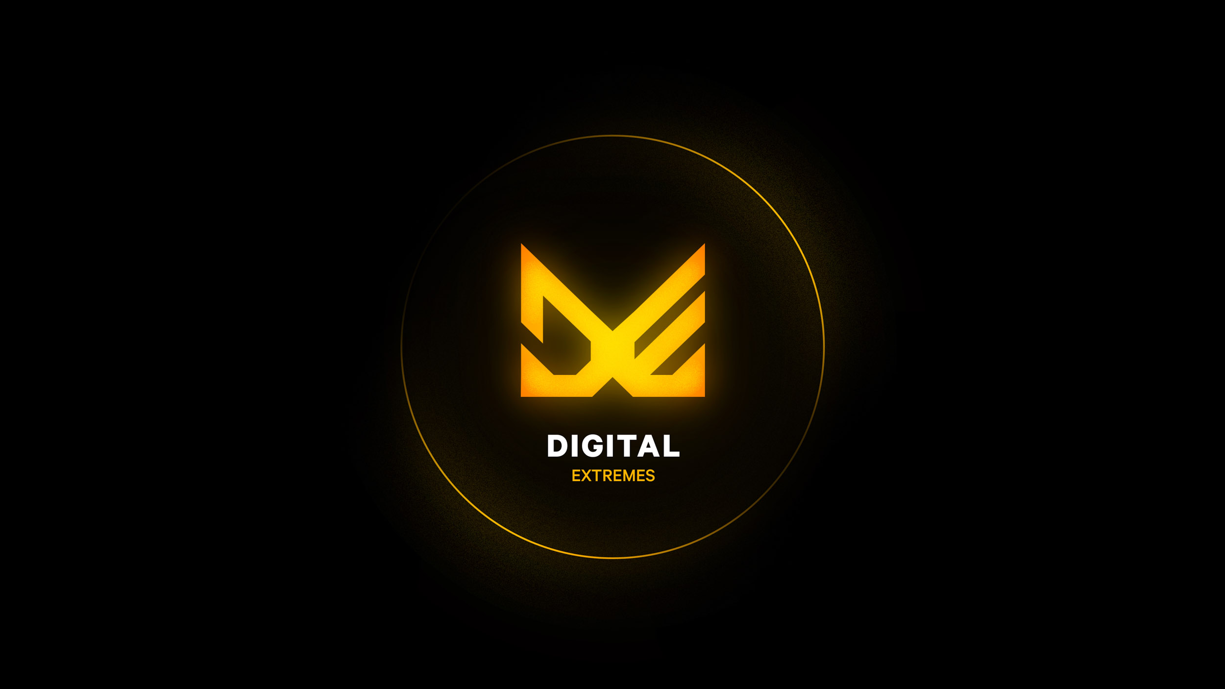
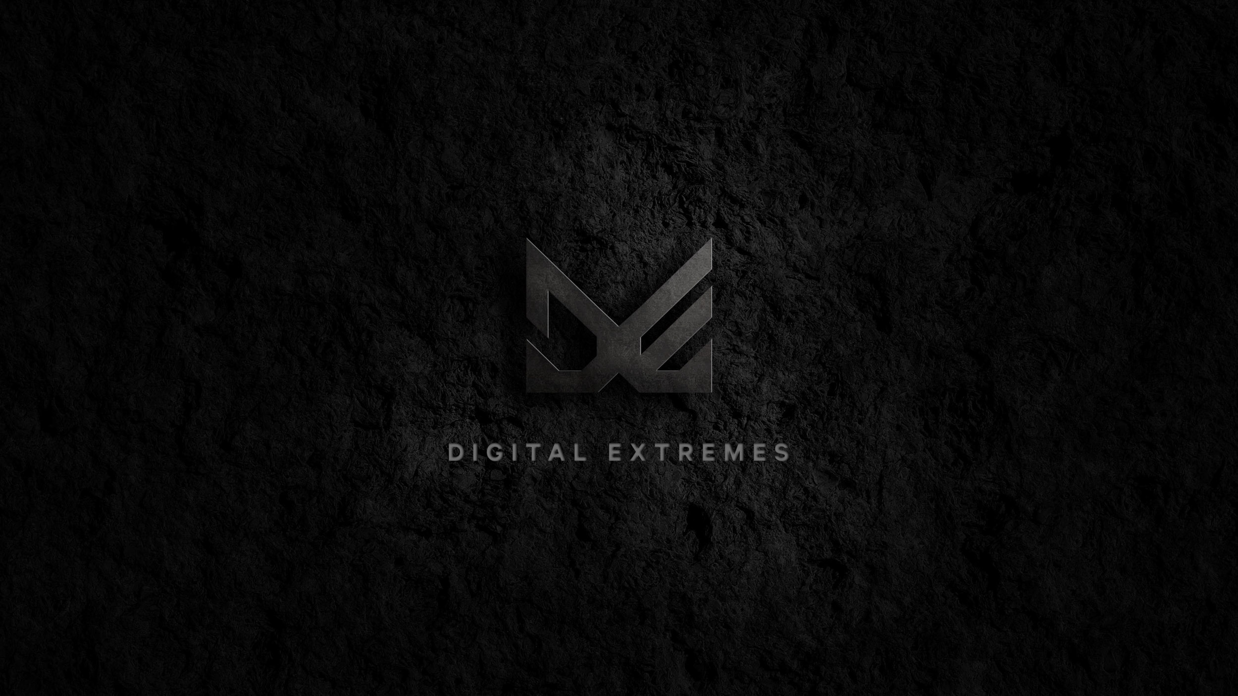
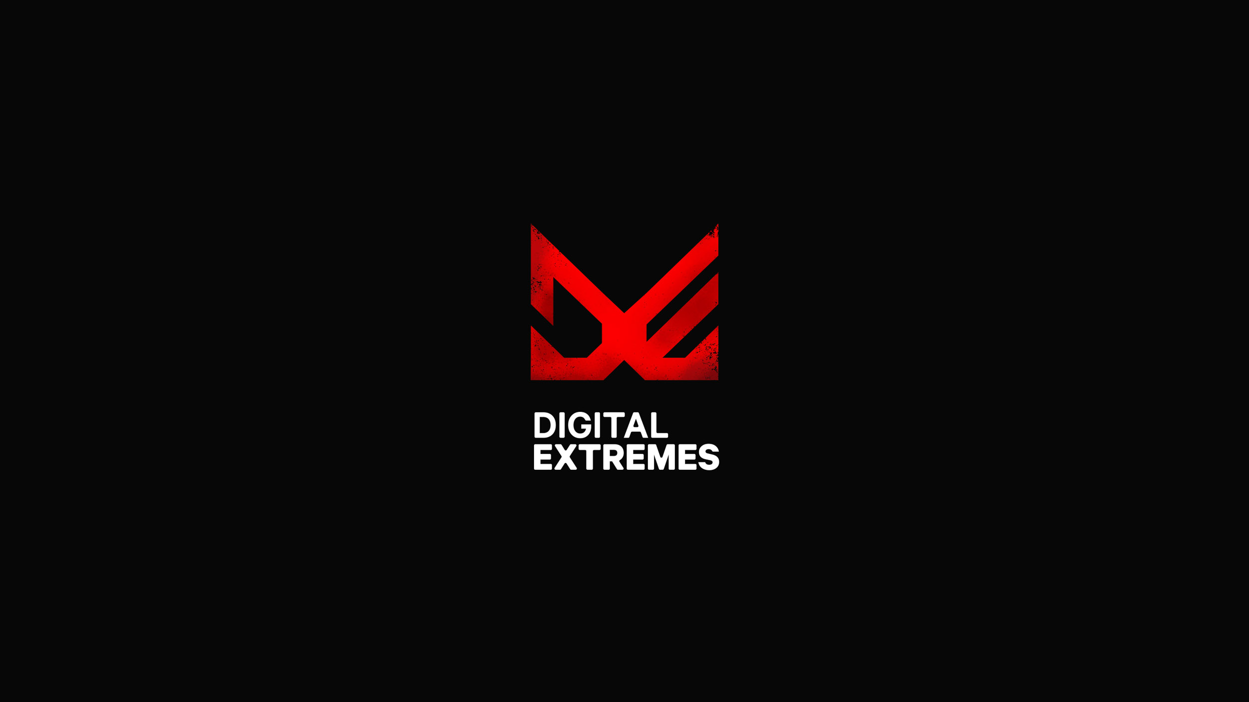
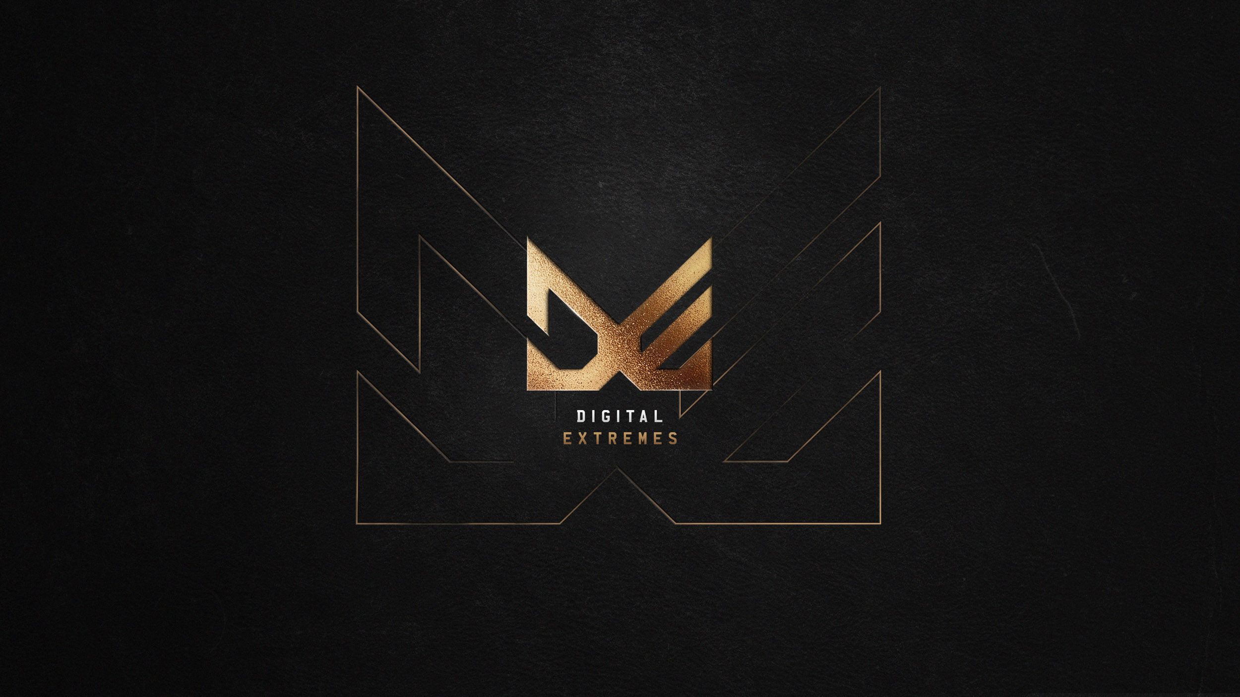
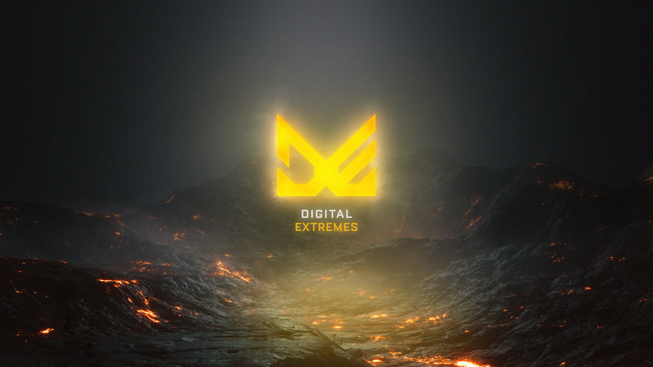
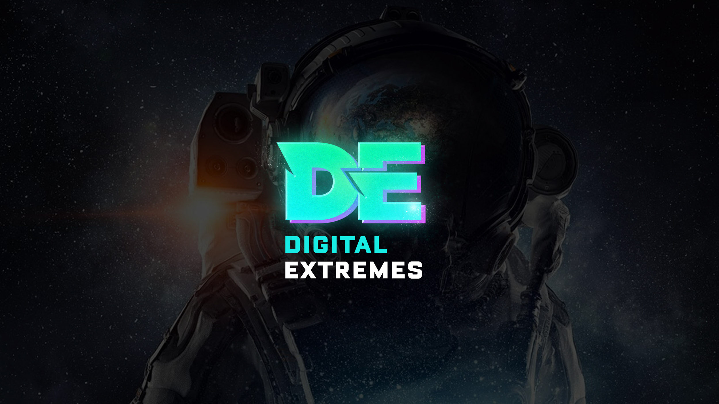
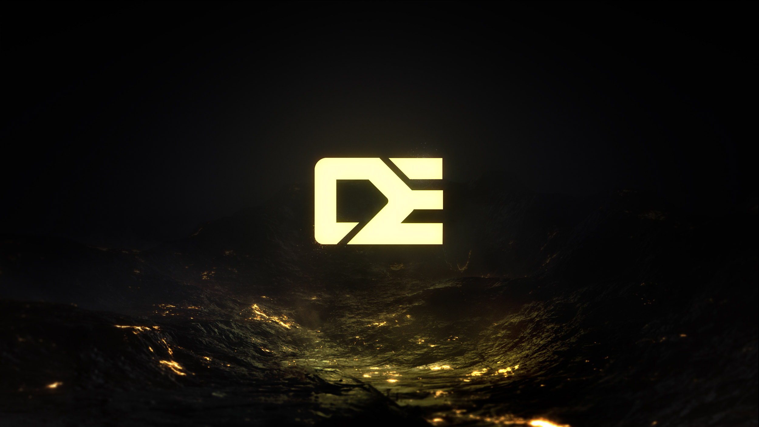
COLOR
EXPLORATION
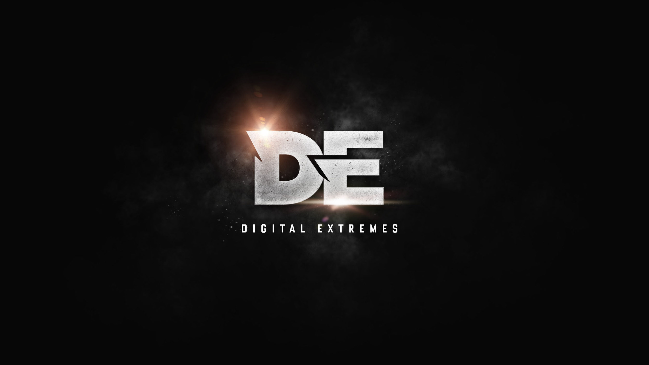
C O N C E P T 1
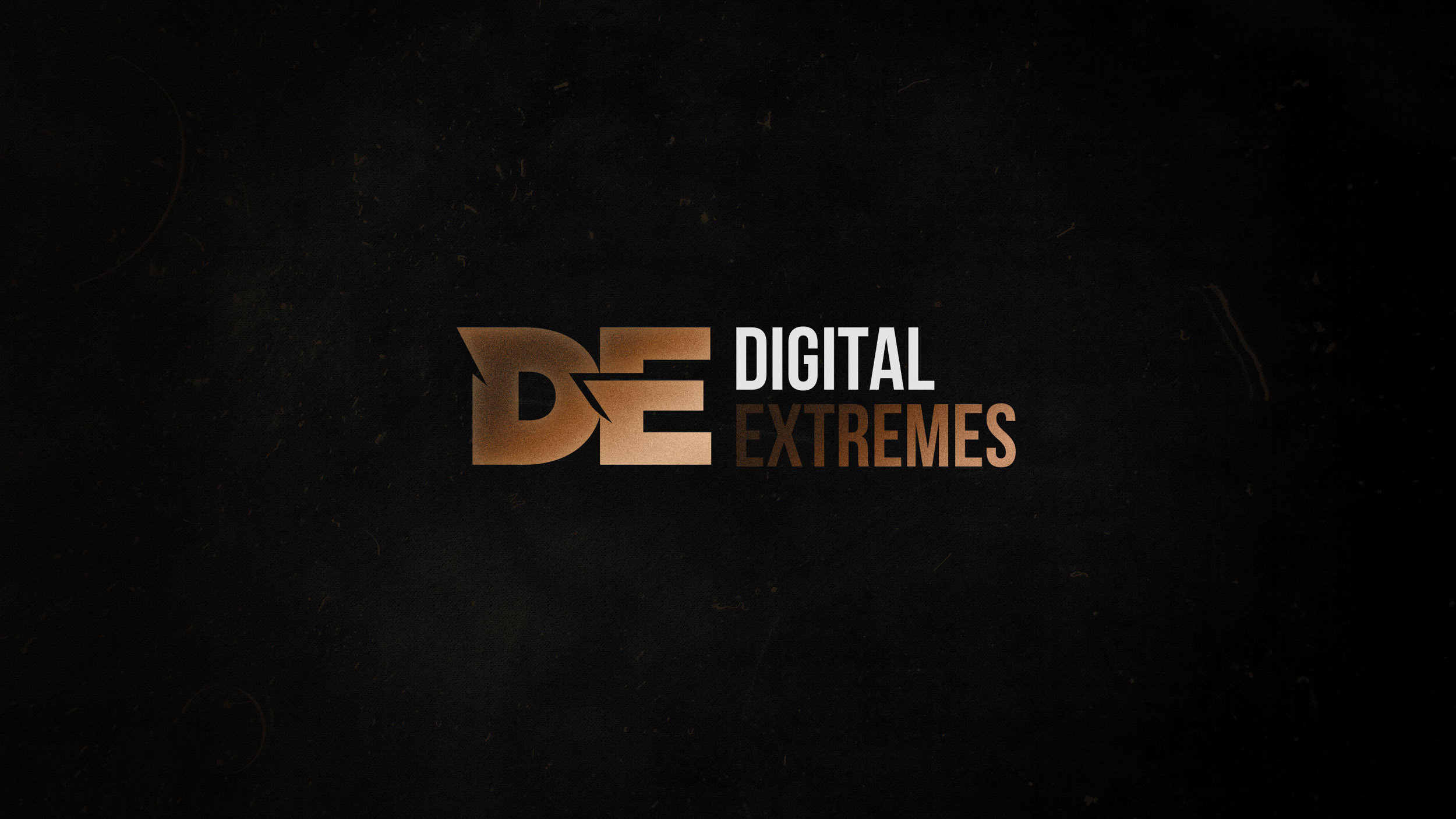
C O N C E P T 2
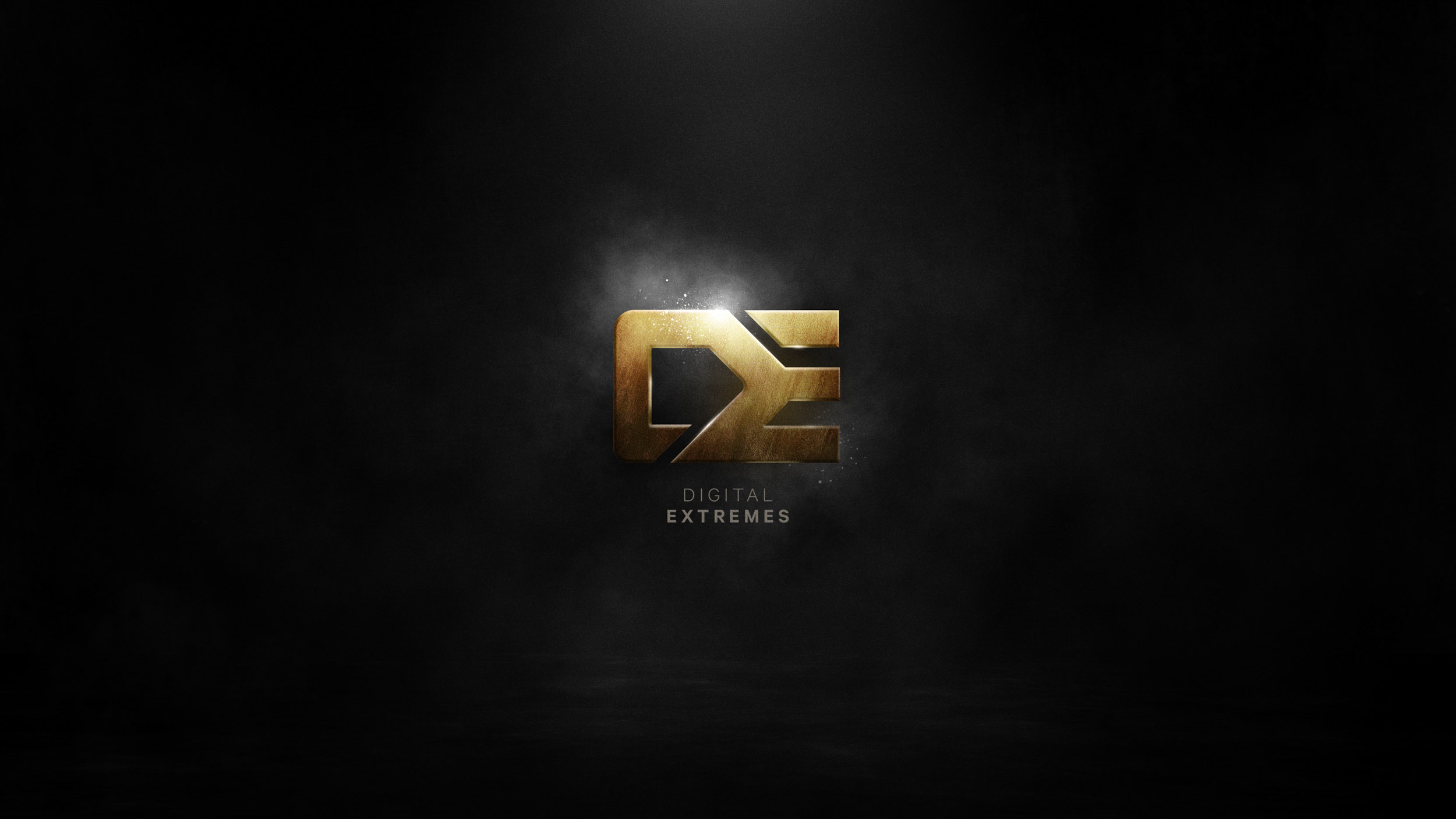
C O N C E P T 2
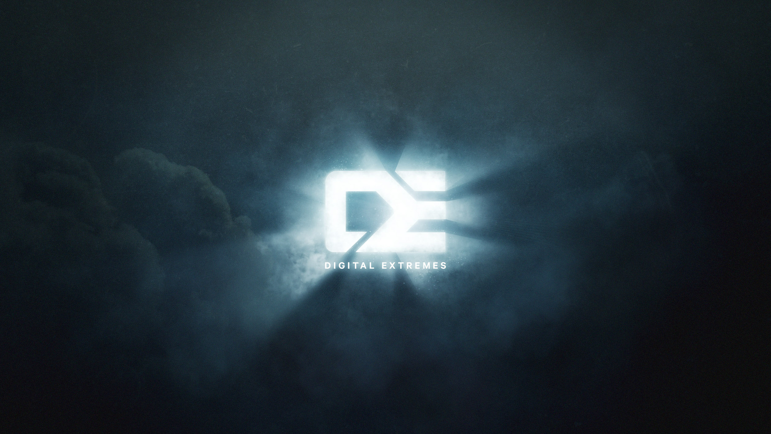
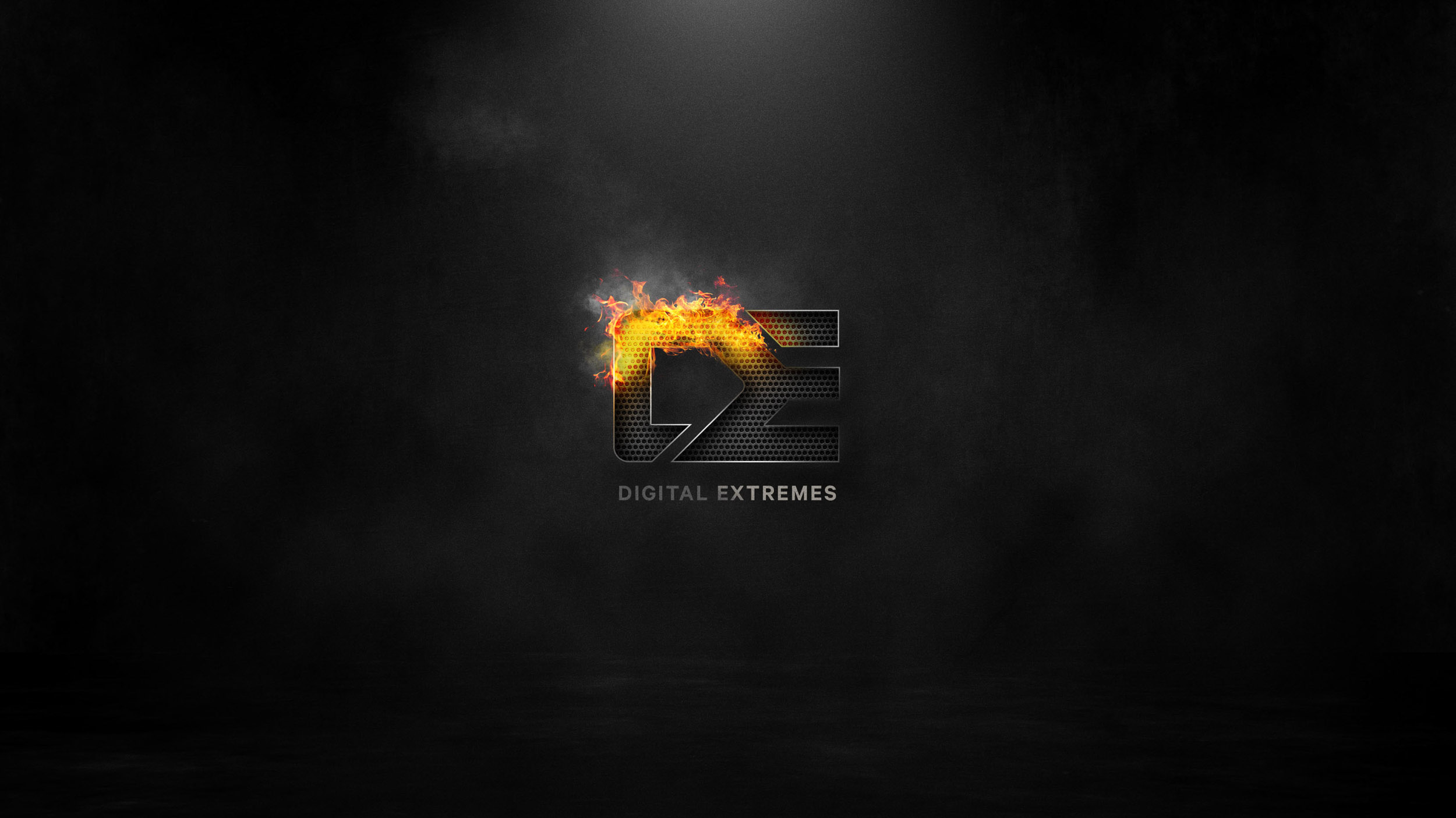
ANIMATION
EXPLORATION
C O N C E P T 1
C O N C E P T 2

C O N C E P T 3